The number counter is a great way to display numbers in a fun and engaging way. This module is commonly used to display statistics about yourself or your company. For example, display your customer count or Facebook followers is a great way to showcase social proof.
VIEW A LIVE DEMO OF THIS MODULE
How To Add A Number Counter Module To Your Page
Before you can add a number counter module to your page, you will first need to jump into the Divi Builder. Once the Divi Theme has been installed on your website, you will notice a Use Divi Builder button above the post editor every time you are building a new page. Clicking this button will enable the Divi Builder, giving you access to all of the Divi Builder’s modules. Next, click the Use Visual Builder button to launch the builder in Visual Mode. You can also click the Use Visual Builder button when browsing your website on the front end if you are logged in to your WordPress Dashboard.

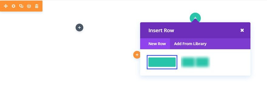
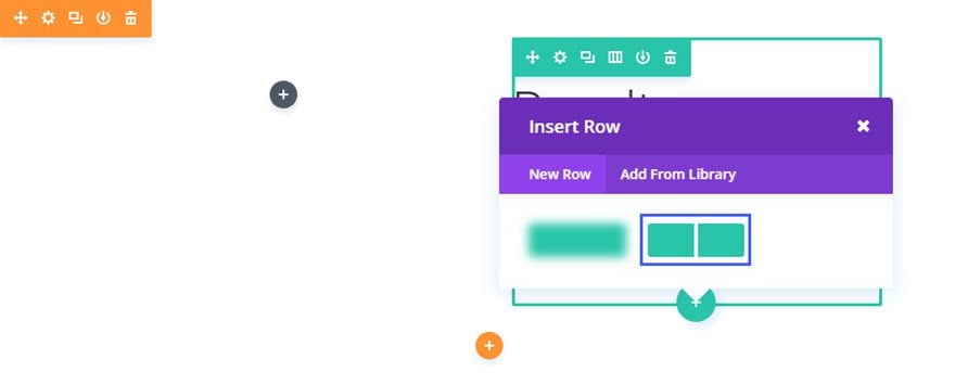
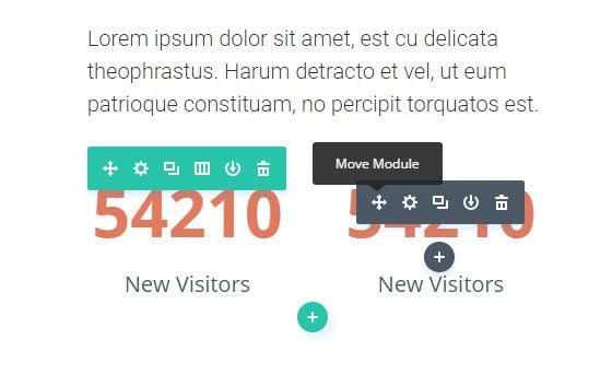
Once you have entered the Visual Builder, you can click the gray plus button to add a new module to your page. New modules can only be added inside of Rows. If you are starting a new page, don’t forget to add a row to your page first. We have some great tutorials about how to use Divi’s row and section elements.
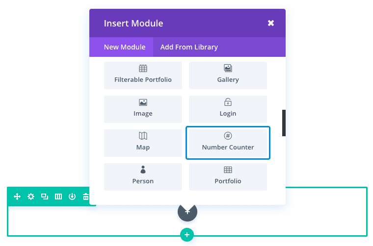
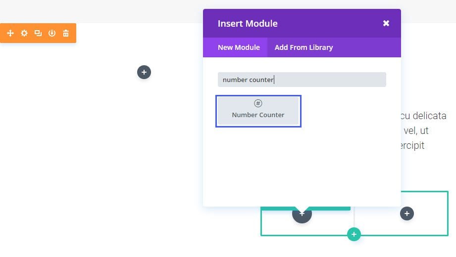
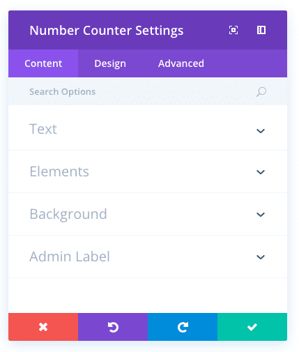
Locate the number counter module within the list of modules and click it to add it to your page. The module list is searchable, which means you can also type the word “number counter” and then click enter to automatically find and add the number counter module! Once the module has been added, you will be greeted with the module’s list of options. These options are separated into three main groups: Content, Design and Advanced.
Use Case Example: Using the Number Counter Module to Display Project Results in a Case Study
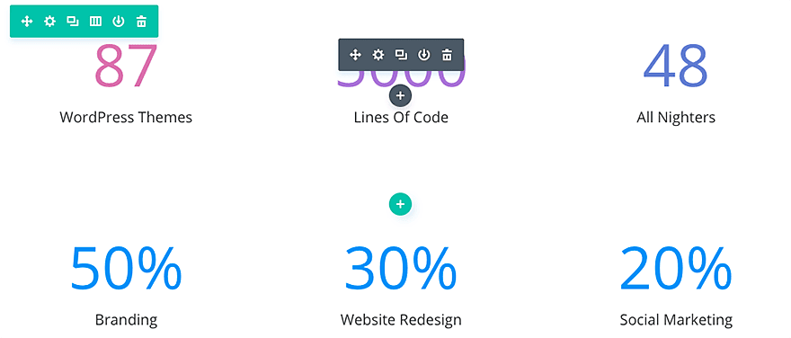
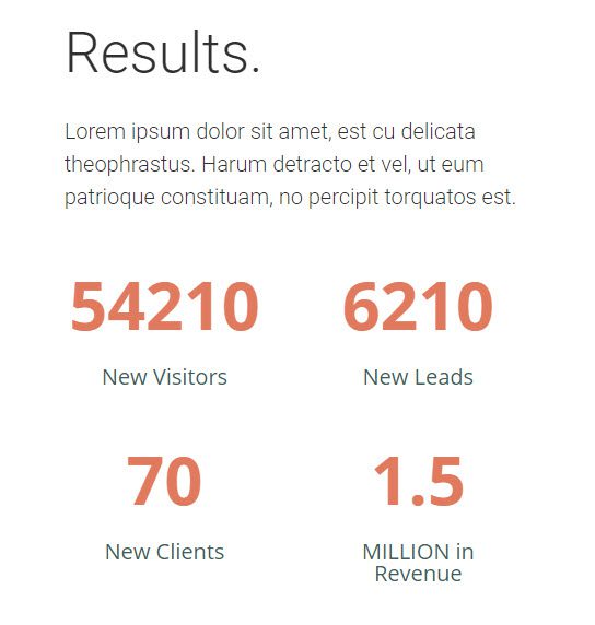
One great ways to use the Number Counter Module is to illustrate stats for case studies. Simply label each number counter with a certain result metric so the user can easily see the success of the project. In this example, I’m using the Number Counter Module to display four project results.
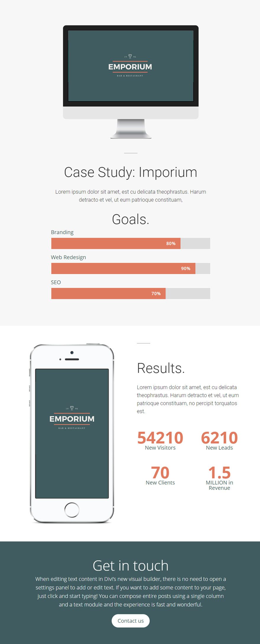
As you can see the, the top of the page includes the three project goals using the Bar Counter Module and the bottom of the page includes the results of the case study using the Number Counter Modules.
The section of the page showing the results of the case study using the Number Modules requires the use of a Specialy Section. Using the Visual Builder, add a Specialty Section to the page and select the following layout:
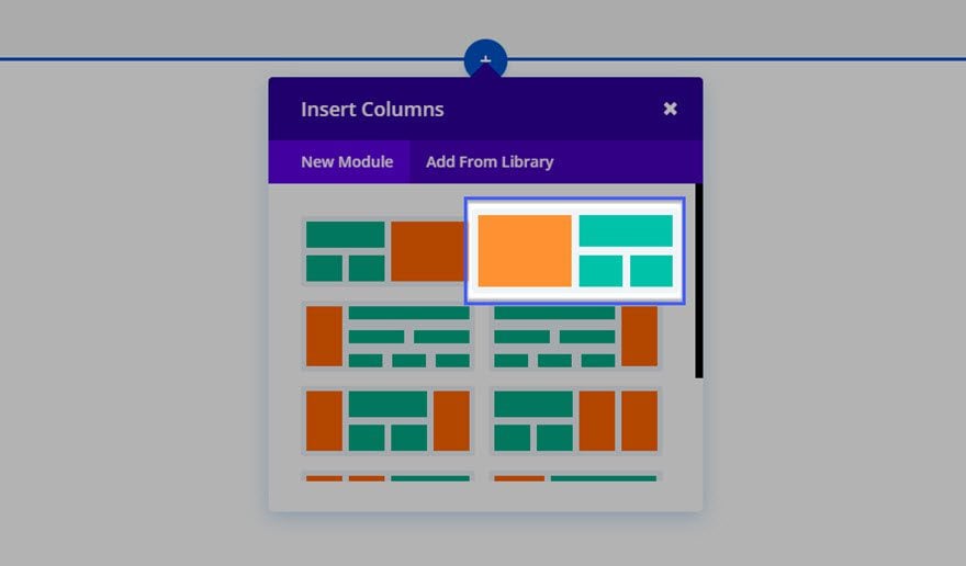
Select a 1 column layout for the right side of the section and enter the Headline and text needed for the case study results.
Insert a 2 column layout directly under the 1 column layout on the right side of the section.
Now add your first Number Counters Module to the left column.
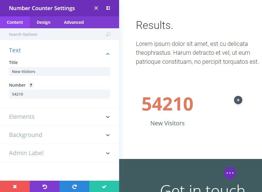
Update the Number Counters Settings as follows:
Content Options
Title: New Visitors
Number: 54210
Percent Sign: OFF
Design Options
Text Color: Dark
Title font: default
Title Font Size: 20px
Title Text Color: #405c60
Title Line Height: 1em
Number Font: Default, Bold
Number Font Size: 60px
Number Text color: #e07a5e
Number Line Height: 72px
Save Settings
Duplicate the Number Counters Module and drag it into the adjacent right column and update the Title and Number options.
Duplicate the row that holds the two Number Counters Modules so that two more number counters are displayed below.
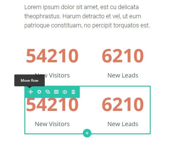
Then update the Title and Number options for those as well. Now you have all four number counters complete.
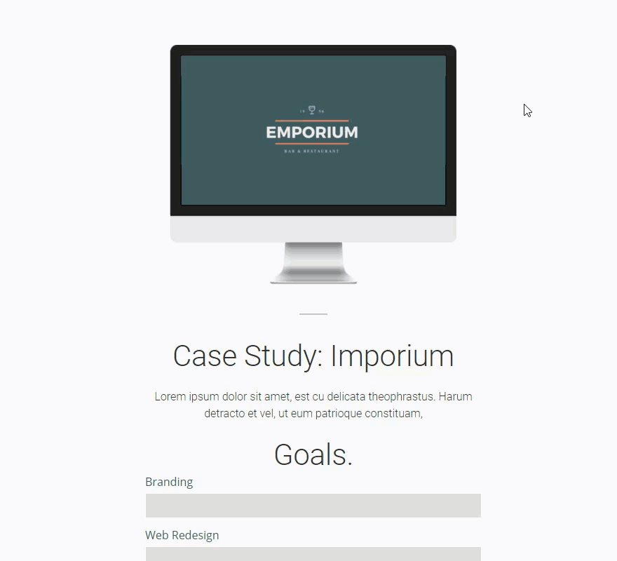
Don’t forget to add the 667 x 320 image to the left column/side of the specialty section.
It is finished! The combination of Number Counters and Bar Counters on this case study page really makes the content engaging.
Number Counter Content Options
Within the content tab you will find all of the module’s content elements, such as text, images and icons. Anything that controls what appears in your module will always be found within this tab.
Title
Input a title for the counter. This will be displayed below the number in smaller text.
Number
This is the number that the counter will count to. As you scroll down the page and reach the counter, the number will quickly count up from 0 until it reaches the number you define here. Only number values can be placed here.
Percent Sign
Here you can choose whether the percent sign should be added after the number set above.
Background Color
Define a custom background color for your module, or leave blank to use the default color.
Background Image
If defined, this image will be used as the background for this module. To remove a background image, simply delete the URL from the settings field. Background images will appear above background colors, which means your background color will not be visible when a background image is applied.
Admin Label
This will change the label of the module in the builder for easy identification. When using WireFrame view in the Visual Builder, these labels will appear within the module block in the Divi Builder interface.
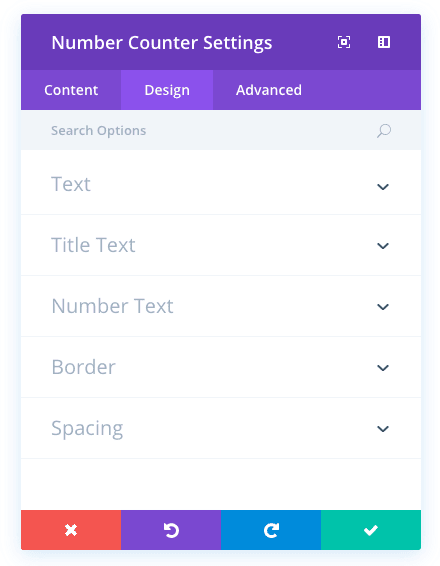
Number Counter Design Options
Within the design tab you will find all of the module’s styling options, such as fonts, colors, sizing and spacing. This is the tab you will use to change how your module looks. Every Divi module has a long list of design settings that you can use to change just about anything.
Text Color
Here you can choose whether your title text should be light or dark. If you are working with a dark background, then your text should be light. If your background is light, then your text should be set to dark.
Title Font
You can change the font of your title text by selecting your desired font from the dropdown menu. Divi comes with dozens of great fonts powered by Google Fonts. By default, Divi uses the Open Sans font for all text on your page. You can also customize the style of your text using the bold, italic, all-caps and underline options.
Title Font Size
Here you can adjust the size of your title text. You can drag the range slider to increase or decrease the size of your text, or you can input your desired text size value directly into the input field to the right of the slider. The input fields supports different units of measurement, which means you can input “px” or “em” following your size value to change its unit type.
Title Text Color
By default, all text colors in Divi will appear as white or dark gray. If you would like to change the color of your title text, choose your desired color from the color picker using this option.
Title Letter Spacing
Letter spacing affects the space between each letter. If you would like to increase the space between each letter in your title text, use the range slider to adjust the space or input your desired spacing size into the input field to the right of the slider. The input fields supports different units of measurement, which means you can input “px” or “em” following your size value to change its unit type.
Title Line Height
Line height affects the space between each line of your title text If you would like to increase the space between each line, use the range slider to adjust the space or input your desired spacing size into the input field to the right of the slider. The input fields supports different units of measurement, which means you can input “px” or “em” following your size value to change its unit type.
Number Font
You can change the font of your number text by selecting your desired font from the dropdown menu. Divi comes with dozens of great fonts powered by Google Fonts. By default, Divi uses the Open Sans font for all text on your page. You can also customize the style of your text using the bold, italic, all-caps and underline options.
Number Font Size
Here you can adjust the size of your number text. You can drag the range slider to increase or decrease the size of your text, or you can input your desired text size value directly into the input field to the right of the slider. The input fields supports different units of measurement, which means you can input “px” or “em” following your size value to change its unit type.
Number Text Color
By default, all text colors in Divi will appear as white or dark gray. If you would like to change the color of your number text, choose your desired color from the color picker using this option.
Number Letter Spacing
Letter spacing affects the space between each letter. If you would like to increase the space between each letter in your number text, use the range slider to adjust the space or input your desired spacing size into the input field to the right of the slider. The input fields supports different units of measurement, which means you can input “px” or “em” following your size value to change its unit type.
Number Line Height
Line height affects the space between each line of your number text If you would like to increase the space between each line, use the range slider to adjust the space or input your desired spacing size into the input field to the right of the slider. The input fields supports different units of measurement, which means you can input “px” or “em” following your size value to change its unit type.
Use Border
Enabling this option will place a border around your module. This border can be customized using the following conditional settings.
Border Color
This option affects the color of your border. Select a custom color from the color picker to apply it to your border.
Border Width
By default, borders have a width of 1 pixel. You can increase this value by dragging the range slider or by inputting a custom value into the input field to the right of the slider. Custom units of measurements of supported, which means you can change the default unit from “px” to something else, such as em, vh, vw etc.
Border Style
Borders support eight different styles, including: solid, dotted, dashed, double, groove, ridge, inset and outset. Select your desired style from the dropdown menu to apply it to your border.
Custom Padding
Padding is the space added inside of your module, between the edge of the module and its internal elements. You can add custom padding values to any of the module’s four sides. To remove custom margin, delete the added value from the input field. By default these values are measured in pixels, but you can input custom units of measurement into the input fields.
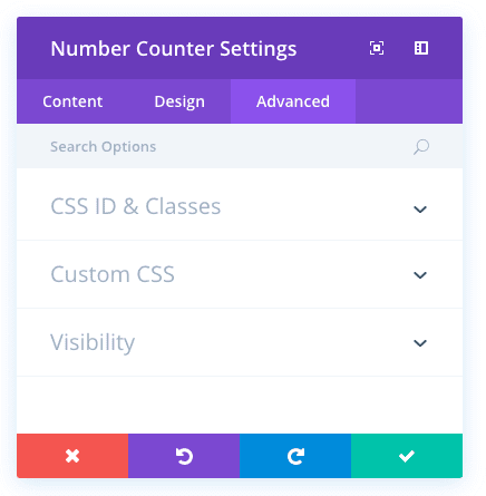
Number Counter Advanced Options
Within the advanced tab, you will find options that more experienced web designers might find useful, such as custom CSS and HTML attributes. Here you can apply custom CSS to any of the module’s many elements. You can also apply custom CSS classes and IDs to the module, which can be used to customize the module within your child theme’s style.css file.
CSS ID
Enter an optional CSS ID to be used for this module. An ID can be used to create custom CSS styling, or to create links to particular sections of your page.
CSS Class
Enter optional CSS classes to be used for this module. A CSS class can be used to create custom CSS styling. You can add multiple classes, separated with a space. These classes can be used in your Divi Child Theme or within the Custom CSS that you add to your page or your website using the Divi Theme Options or Divi Builder Page Settings.
Custom CSS
Custom CSS can also be applied to the module and any of the module’s internal elements. Within the Custom CSS section, you will find a text field where you can add custom CSS directly to each element. CSS input into these settings are already wrapped within style tags, so you need only enter CSS rules separated by semicolons.
Visibility
This option lets you control which devices your module appears on. You can choose to disable your module on tablets, smart phones or desktop computers individually. This is useful if you want to use different modules on different devices, or if you want to simplify the mobile design by eliminating certain elements from the page.