The accordion module is a great way to consolidate information within a single system. Accordions are very similar to tabs, except that the items are displayed within a vertical list. When a new item within the list is opened, the previously-opened item is closed and the new item’s content is displayed.
VIEW A LIVE DEMO OF THIS MODULE
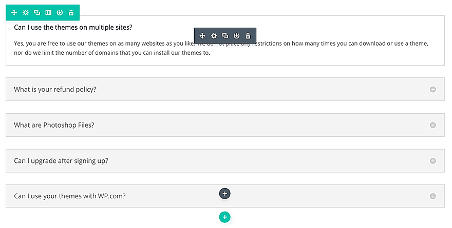
How To Add An Accordion Module To Your Page
Before you can add a accordion module to your page, you will first need to jump into the Divi Builder. Once the Divi Theme has been installed on your website, you will notice a Use Divi Builder button above the post editor every time you are building a new page. Clicking this button will enable the Divi Builder, giving you access to all of the Divi Builder’s modules. Next, click the Use Visual Builder button to launch the builder in Visual Mode. You can also click the Use Visual Builder button when browsing your website on the front end if you are logged in to your WordPress Dashboard.

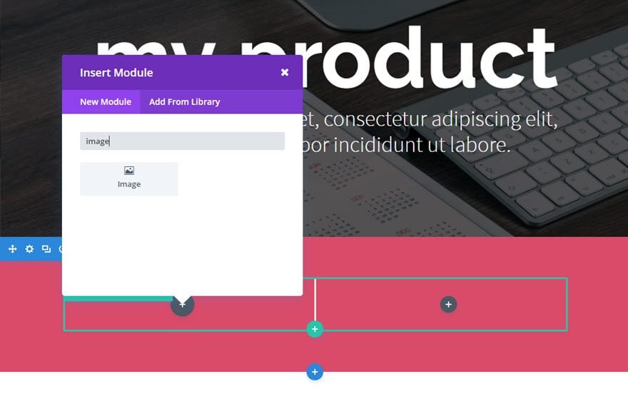
Once you have entered the Visual Builder, you can click the gray plus button to add a new module to your page. New modules can only be added inside of Rows. If you are starting a new page, don’t forget to add a row to your page first. We have some great tutorials about how to use Divi’s row and section elements.
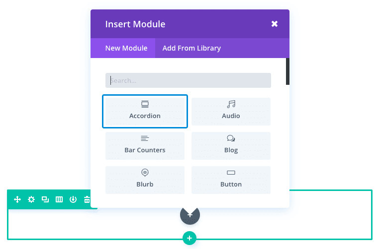
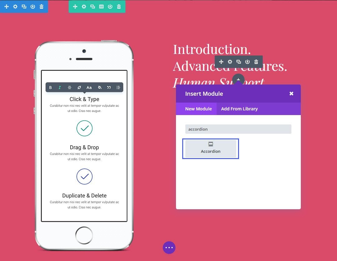
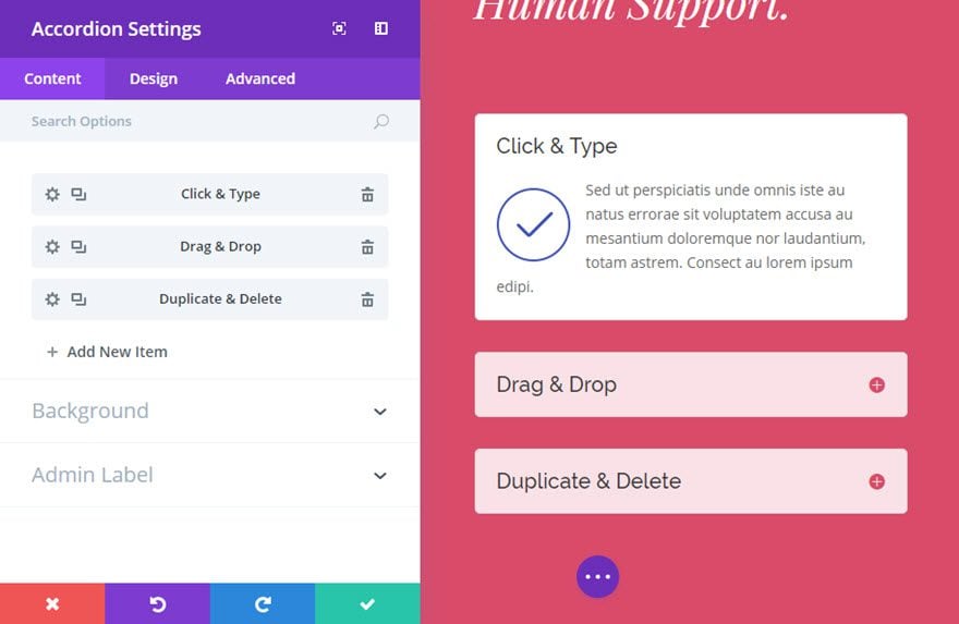
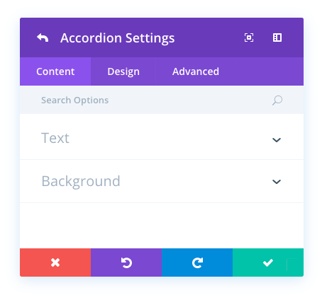
Locate the accordion module within the list of modules and click it to add it to your page. The module list is searchable, which means you can also type the word “accordion” and then click enter to automatically find and add the accordion module! Once the module has been added, you will be greeted with the module’s list of options. These options are separated into three main groups: Content, Design and Advanced.
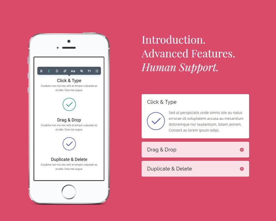
Use Case Example: Showcasing Product Features Using the Accordion Module
For this example, I’m going to show you how to add product features to a product page using the Accordion Module.
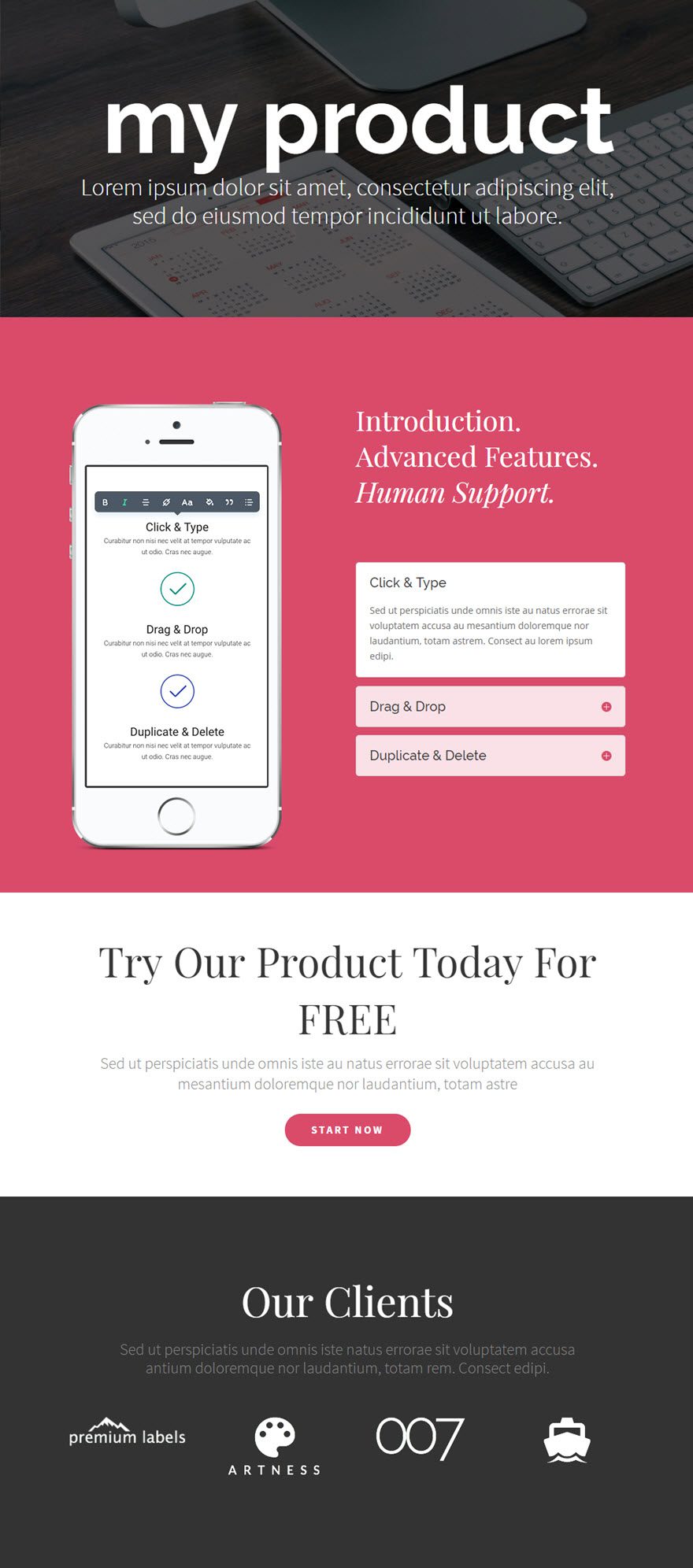
Here is the toggle module in action:
Let’s get started.
Use the visual builder to add a Regular Section with a 1/2 1/2 (2 column) row. Edit the section settings to change the background color to #d94b6a (pink).
On the left column, add your product image.
On the right column, add a Text Module to serve as a header above the Accordion Module.
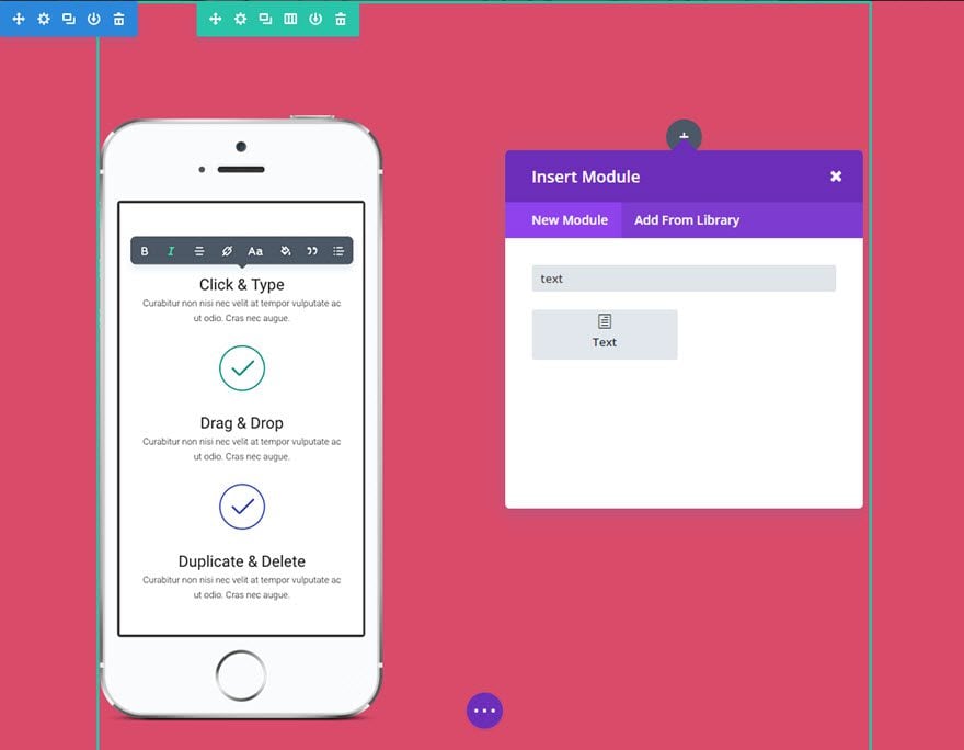
Finally, add the Accordion Module directly under the Text Module on the right column.
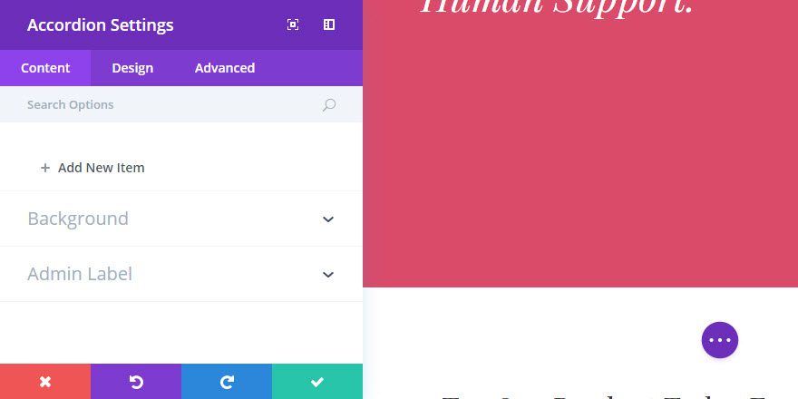
Update the Accordion Settings as follows:
Content Options
Open Toggle Background Color: #ffffff
Closed Toggle Background Color: rgba(255,255,255,0.83)
Design Options
Icon Color: #d94b6a
Open Toggle Text Color: #333333
Closed Toggle Text Color: #333333
Toggle Font: Raleway
Toggle Font Size: 20px
Save Settings
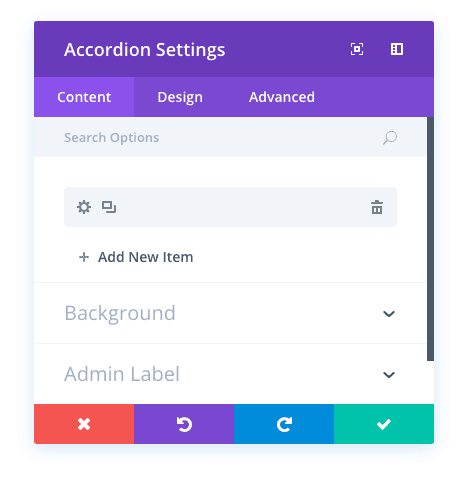
Under the Content tab, click + Add New Item to add your first accordion to the module.
Update the Individual Accordion Settings as follows:
Content Options
Title: [enter title]
Content: [enter content]

Note: Since we already configured the design options for the Accordion Module Settings, there is no need to update the design of the individual accordion settings unless you want to override the Module settings.
Now duplicate the accordion item you just created twice and update the Title and Content for each of the duplicates as needed.
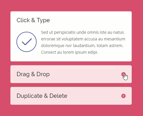
That’s it! The accordion looks great and keeps the content compact, fitting nicely in the section of the page.
Accordion Content Options
Within the content tab you will find all of the module’s content elements, such as text, images and icons. Anything that controls what appears in your module will always be found within this tab.
Open Toggle Background Color
The background color of each accordion toggle is different when it is in its open and closed state. Here you can adjust the background color of opened toggles. Select your desired color from the color picker to apply it to your module.
Closed Toggle Background Color
The background color of each accordion toggle is different when it is in its open and closed state. Here you can adjust the background color of closed toggles. Select your desired color from the color picker to apply it to your module.
Background Image
If defined, this image will be used as the background for this module. To remove a background image, simply delete the URL from the settings field. Background images will appear above background colors, which means your background color will not be visible when a background image is applied.
Admin Label
This will change the label of the module in the builder for easy identification. When using WireFrame view in the Visual Builder, these labels will appear within the module block in the Divi Builder interface.
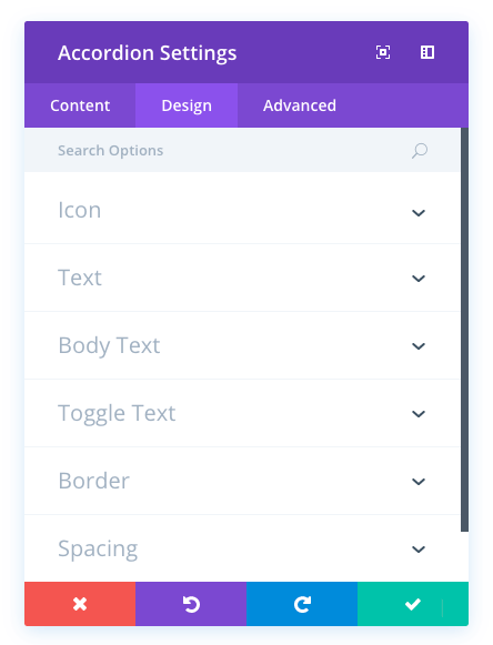
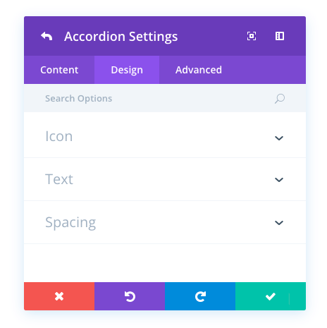
Accordion Design Options
Within the design tab you will find all of the module’s styling options, such as fonts, colors, sizing and spacing. This is the tab you will use to change how your module looks. Every Divi module has a long list of design settings that you can use to change just about anything.
Icon Color
Here you can adjust the color of the icon that appears inside of each toggle, to the inner right of the toggle rectangle. If you are adjusting the background color of your toggle, you may want to adjust the icon color to better compliment your custom color.
Open Toggle Text Color
The text color of each accordion toggle is different when it is in its open and closed state. Here you can adjust the text color of opened toggles. Select your desired color from the color picker to apply it to your module.
Closed Toggle Text Color
The text color of each accordion toggle is different when it is in its open and closed state. Here you can adjust the text color of closed toggles. Select your desired color from the color picker to apply it to your module.
Body Font
You can change the font of your body text by selecting your desired font from the dropdown menu. Divi comes with dozens of great fonts powered by Google Fonts. By default, Divi uses the Open Sans font for all text on your page. You can also customize the style of your text using the bold, italic, all-caps and underline options.
Body Font Size
Here you can adjust the size of your body text. You can drag the range slider to increase or decrease the size of your text, or you can input your desired text size value directly into the input field to the right of the slider. The input fields supports different units of measurement, which means you can input “px” or “em” following your size value to change its unit type.
Body Text Color
By default, all text colors in Divi will appear as white or dark gray. If you would like to change the color of your body text, choose your desired color from the color picker using this option.
Body Letter Spacing
Letter spacing affects the space between each letter. If you would like to increase the space between each letter in your body text, use the range slider to adjust the space or input your desired spacing size into the input field to the right of the slider. The input fields supports different units of measurement, which means you can input “px” or “em” following your size value to change its unit type.
Body Line Height
Line height affects the space between each line of your body text If you would like to increase the space between each line, use the range slider to adjust the space or input your desired spacing size into the input field to the right of the slider. The input fields supports different units of measurement, which means you can input “px” or “em” following your size value to change its unit type.
Toggle Font
You can change the font of your toggle text by selecting your desired font from the dropdown menu. Divi comes with dozens of great fonts powered by Google Fonts. By default, Divi uses the Open Sans font for all text on your page. You can also customize the style of your text using the bold, italic, all-caps and underline options.
Toggle Font Size
Here you can adjust the size of your toggle text. You can drag the range slider to increase or decrease the size of your text, or you can input your desired text size value directly into the input field to the right of the slider. The input fields supports different units of measurement, which means you can input “px” or “em” following your size value to change its unit type.
Toggle Text Color
By default, all text colors in Divi will appear as white or dark gray. If you would like to change the color of your toggle text, choose your desired color from the color picker using this option.
Toggle Letter Spacing
Letter spacing affects the space between each letter. If you would like to increase the space between each letter in your toggle text, use the range slider to adjust the space or input your desired spacing size into the input field to the right of the slider. The input fields supports different units of measurement, which means you can input “px” or “em” following your size value to change its unit type.
Toggle Line Height
Line height affects the space between each line of your toggle text If you would like to increase the space between each line, use the range slider to adjust the space or input your desired spacing size into the input field to the right of the slider. The input fields supports different units of measurement, which means you can input “px” or “em” following your size value to change its unit type.
Use Border
Enabling this option will place a border around your module. This border can be customized using the following conditional settings.
Border Color
This option affects the color of your border. Select a custom color from the color picker to apply it to your border.
Border Width
By default, borders have a width of 1 pixel. You can increase this value by dragging the range slider or by inputting a custom value into the input field to the right of the slider. Custom units of measurements of supported, which means you can change the default unit from “px” to something else, such as em, vh, vw etc.
Border Style
Borders support eight different styles, including: solid, dotted, dashed, double, groove, ridge, inset and outset. Select your desired style from the dropdown menu to apply it to your border.
Custom Padding
Padding is the space added inside of your module, between the edge of the module and its internal elements. You can add custom padding values to any of the module’s four sides. To remove custom margin, delete the added value from the input field. By default these values are measured in pixels, but you can input custom units of measurement into the input fields.
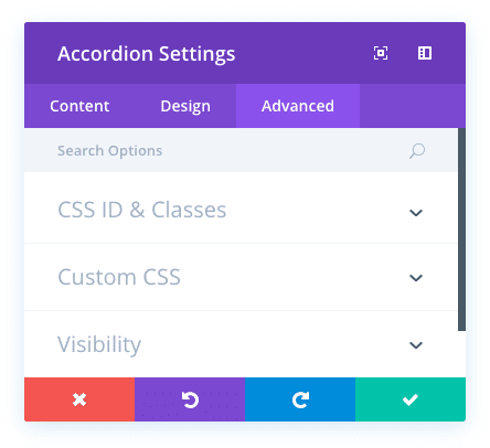
Accordion Advanced Options
Within the advanced tab, you will find options that more experienced web designers might find useful, such as custom CSS and HTML attributes. Here you can apply custom CSS to any of the module’s many elements. You can also apply custom CSS classes and IDs to the module, which can be used to customize the module within your child theme’s style.css file.
CSS ID
Enter an optional CSS ID to be used for this module. An ID can be used to create custom CSS styling, or to create links to particular sections of your page.
CSS Class
Enter optional CSS classes to be used for this module. A CSS class can be used to create custom CSS styling. You can add multiple classes, separated with a space. These classes can be used in your Divi Child Theme or within the Custom CSS that you add to your page or your website using the Divi Theme Options or Divi Builder Page Settings.
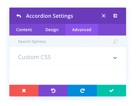
Custom CSS
Custom CSS can also be applied to the module and any of the module’s internal elements. Within the Custom CSS section, you will find a text field where you can add custom CSS directly to each element. CSS input into these settings are already wrapped within style tags, so you need only enter CSS rules separated by semicolons.
Visibility
This option lets you control which devices your module appears on. You can choose to disable your module on tablets, smart phones or desktop computers individually. This is useful if you want to use different modules on different devices, or if you want to simplify the mobile design by eliminating certain elements from the page.
Individual Accordion Content Options
Title
The title will be displayed when the item is closed within the accordion, as well as above the accordion content text when the item has been opened.
Content
The content is displayed within the item box when the accordion item has been opened, below the title.
Open Toggle Background Color
The background color of each accordion toggle is different when it is in its open and closed state. Here you can adjust the background color of opened toggles. Select your desired color from the color picker to apply it to your module.
Closed Toggle Background Color
The background color of each accordion toggle is different when it is in its open and closed state. Here you can adjust the background color of closed toggles. Select your desired color from the color picker to apply it to your module.
Background Image
If defined, this image will be used as the background for this module. To remove a background image, simply delete the URL from the settings field. Background images will appear above background colors, which means your background color will not be visible when a background image is applied.
Individual Accordion Design Options
Icon Color
Here you can adjust the color of the icon that appears inside of each toggle, to the inner right of the toggle rectangle. If you are adjusting the background color of your toggle, you may want to adjust the icon color to better compliment your custom color.
Open Toggle Text Color
The text color of each accordion toggle is different when it is in its open and closed state. Here you can adjust the text color of opened toggles. Select your desired color from the color picker to apply it to your module.
Closed Toggle Text Color
The text color of each accordion toggle is different when it is in its open and closed state. Here you can adjust the text color of closed toggles. Select your desired color from the color picker to apply it to your module.
Custom Padding
Padding is the space added inside of your module, between the edge of the module and its internal elements. You can add custom padding values to any of the module’s four sides. To remove custom margin, delete the added value from the input field. By default these values are measured in pixels, but you can input custom units of measurement into the input fields.
Individual Accordion Advanced Options
Custom CSS
Custom CSS can also be applied to the module and any of the module’s internal elements. Within the Custom CSS section, you will find a text field where you can add custom CSS directly to each element. CSS input into these settings are already wrapped within style tags, so you need only enter CSS rules separated by semicolons.