The audio module allows you to embed an audio file + a custom audio player anywhere on your page. The audio player assumes the clean/modern style of the Divi theme. This is a great feature for musicians who want to show off their latest creations, or podcasters who want to post their latest shows.
VIEW A LIVE DEMO OF THIS MODULE
How To Add An Audio Module To Your Page
Before you can add an audio module to your page, you will first need to jump into the Divi Builder. Once the Divi Theme has been installed on your website, you will notice a Use Divi Builder button above the post editor every time you are building a new page. Clicking this button will enable the Divi Builder, giving you access to all of the Divi Builder’s modules. Next, click the Use Visual Builder button to launch the builder in Visual Mode. You can also click the Use Visual Builder button when browsing your website on the front end if you are logged in to your WordPress Dashboard.

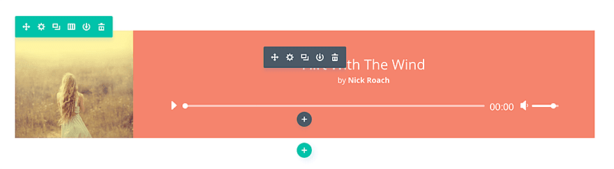
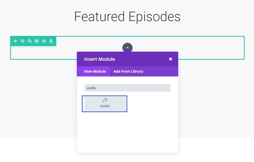
Once you have entered the Visual Builder, you can click the gray plus button to add a new module to your page. New modules can only be added inside of Rows. If you are starting a new page, don’t forget to add a row to your page first. We have some great tutorials about how to use Divi’s row and section elements.
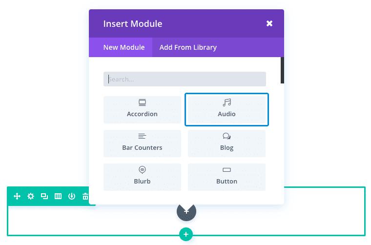
Locate the audio module within the list of modules and click it to add it to your page. The module list is searchable, which means you can also type the word “audio” and then click enter to automatically find and add the audio module! Once the module has been added, you will be greeted with the module’s list of options. These options are separated into three main groups: Content, Design and Advanced.
Use Case Example: Add a Featured Podcast Episode to a Podcaster’s Site Homepage
For this example, I’m going to show you how to use the Audio Module to create a custom audio player for a feature podcast.
Here is the page with the Featured Podcast at the bottom:
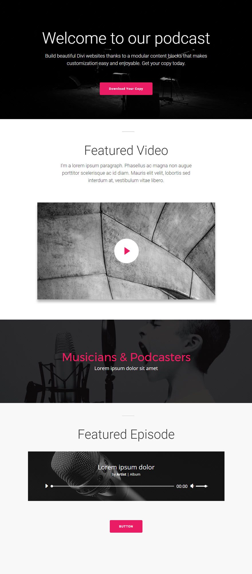
Let’s get started.
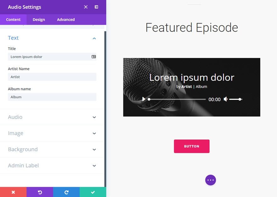
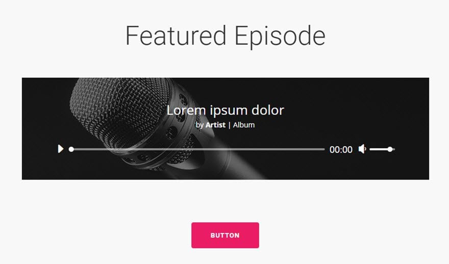
Use the visual builder to add a Regular Section with a fullwidth (1 Column) row. Change the row setting to have a custom width of 800px. Then add an Audio Module to the row.
Update the Module Settings as follows:
Content Options
Title: [enter title]
Artist Name: [enter artist]
Album Name: [enter album]
Audio: [upload audio file]
background image: [upload 800 x 281 background image]
background image position: Bottom Center
Design Options
Text Color: Light
That’s it!
The audio module really is easy to use and looks great.
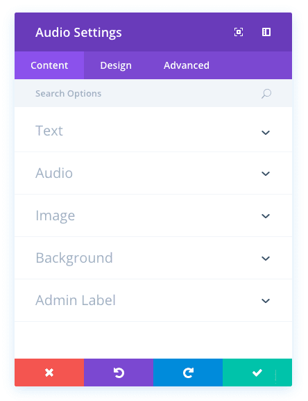
Audio Content Options
Within the content tab you will find all of the module’s content elements, such as text, images and icons. Anything that controls what appears in your module will always be found within this tab.
Title
The title of the audio module is displayed within the audio player. This is typically the name of your song.
Artist Name
Here you can input an artist name. This will be displayed in the audio player below the title.
Album Name
If your audio file is a song that is part of a larger album, you can input an album name here. This name will appear below the artist name within the module.
Audio File
Define the audio file for use in the module. To remove an audio file from the module, simply delete the URL from the settings field. Click the “upload” button to upload an audio file from your computer to be used in the audio player.
Cover Art Image
Cover art images are displayed to the left, or above the audio controls (depending on your column width). Click the “Upload” button to upload an image from your computer to be used as your cover photo.
Background Color
Define a custom background color for your module, or leave blank to use the default color.
Background Image
If defined, this image will be used as the background for this module. To remove a background image, simply delete the URL from the settings field.
Admin Label
This will change the label of the module in the builder for easy identification.
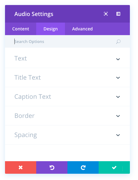
Audio Design Options
Within the design tab you will find all of the module’s styling options, such as fonts, colors, sizing and spacing. This is the tab you will use to change how your module looks. Every Divi module has a long list of design settings that you can use to change just about anything.
Text Color
Here you can choose whether your text should be light or dark. If you are working with a dark background, then your text should be light. If your background is light, then your text should be set to dark.
Title Font
You can change the font of your title text by selecting your desired font from the dropdown menu. Divi comes with dozens of great fonts powered by Google Fonts. By default, Divi uses the Open Sans font for all text on your page. You can also customize the style of your text using the bold, italic, all-caps and underline options.
Title Font Size
Here you can adjust the size of your title text. You can drag the range slider to increase or decrease the size of your text, or you can input your desired text size value directly into the input field to the right of the slider. The input fields supports different units of measurement, which means you can input “px” or “em” following your size value to change its unit type.
Title Text Color
By default, all text colors in Divi will appear as white or dark gray. If you would like to change the color of your title text, choose your desired color from the color picker using this option.
Title Letter Spacing
Letter spacing affects the space between each letter. If you would like to increase the space between each letter in your title text, use the range slider to adjust the space or input your desired spacing size into the input field to the right of the slider. The input fields supports different units of measurement, which means you can input “px” or “em” following your size value to change its unit type.
Title Line Height
Line height affects the space between each line of your title text If you would like to increase the space between each line, use the range slider to adjust the space or input your desired spacing size into the input field to the right of the slider. The input fields supports different units of measurement, which means you can input “px” or “em” following your size value to change its unit type.
Caption Font
You can change the font of your caption text by selecting your desired font from the dropdown menu. Divi comes with dozens of great fonts powered by Google Fonts. By default, Divi uses the Open Sans font for all text on your page. You can also customize the style of your text using the bold, italic, all-caps and underline options.
Caption Font Size
Here you can adjust the size of your caption text. You can drag the range slider to increase or decrease the size of your text, or you can input your desired text size value directly into the input field to the right of the slider. The input fields supports different units of measurement, which means you can input “px” or “em” following your size value to change its unit type.
Caption Text Color
By default, all text colors in Divi will appear as white or dark gray. If you would like to change the color of your caption text, choose your desired color from the color picker using this option.
Caption Letter Spacing
Letter spacing affects the space between each letter. If you would like to increase the space between each letter in your caption text, use the range slider to adjust the space or input your desired spacing size into the input field to the right of the slider. The input fields supports different units of measurement, which means you can input “px” or “em” following your size value to change its unit type.
Caption Line Height
Line height affects the space between each line of your caption text If you would like to increase the space between each line, use the range slider to adjust the space or input your desired spacing size into the input field to the right of the slider. The input fields supports different units of measurement, which means you can input “px” or “em” following your size value to change its unit type.
Use Border
Enabling this option will place a border around your module. This border can be customized using the following conditional settings.
Border Color
This option affects the color of your border. Select a custom color from the color picker to apply it to your border.
Border Width
By default, borders have a width of 1 pixel. You can increase this value by dragging the range slider or by inputting a custom value into the input field to the right of the slider. Custom units of measurements of supported, which means you can change the default unit from “px” to something else, such as em, vh, vw etc.
Border Style
Borders support eight different styles, including: solid, dotted, dashed, double, groove, ridge, inset and outset. Select your desired style from the dropdown menu to apply it to your border.
Custom Margin
Margin is the space added outside of your module, between the module and the next element above, below or to the left and right of it. You can add custom margin values to any of the module’s four sides. To remove custom margin, delete the added value from the input field. By default these values are measured in pixels, but you can input custom units of measurement into the input fields.
Custom Padding
Padding is the space added inside of your module, between the edge of the module and its internal elements. You can add custom padding values to any of the module’s four sides. To remove custom margin, delete the added value from the input field. By default these values are measured in pixels, but you can input custom units of measurement into the input fields.
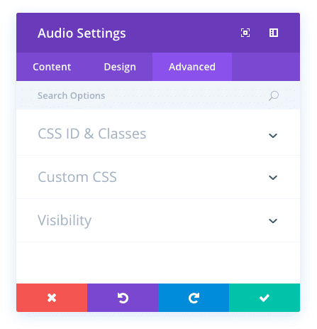
Audio Advanced Options
Within the advanced tab, you will find options that more experienced web designers might find useful, such as custom CSS and HTML attributes. Here you can apply custom CSS to any of the module’s many elements. You can also apply custom CSS classes and IDs to the module, which can be used to customize the module within your child theme’s style.css file.
CSS ID
Enter an optional CSS ID to be used for this module. An ID can be used to create custom CSS styling, or to create links to particular sections of your page.
CSS Class
Enter optional CSS classes to be used for this module. A CSS class can be used to create custom CSS styling. You can add multiple classes, separated with a space. These classes can be used in your Divi Child Theme or within the Custom CSS that you add to your page or your website using the Divi Theme Options or Divi Builder Page Settings.
Custom CSS
Custom CSS can also be applied to the module and any of the module’s internal elements. Within the Custom CSS section, you will find a text field where you can add custom CSS directly to each element. CSS input into these settings are already wrapped within style tags, so you need only enter CSS rules separated by semicolons.
Visibility
This option lets you control which devices your module appears on. You can choose to disable your module on tablets, smart phones or desktop computers individually. This is useful if you want to use different modules on different devices, or if you want to simplify the mobile design by eliminating certain elements from the page.