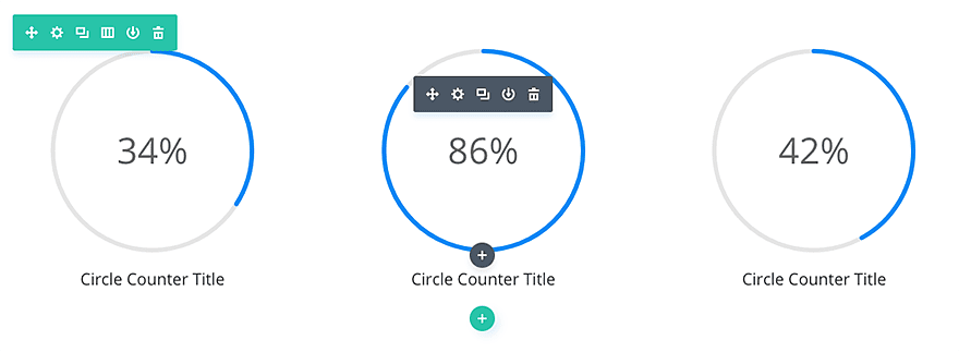
The circle counter provides you with a beautiful and visually-compelling way to display a single statistic. As you scroll down, the number counts up and the circle graph fills to the percentage based location. Try combining multiple circle counter modules on a single page to give your visitors a fun way to learn about your company or your personal skills.
VIEW A LIVE DEMO OF THIS MODULE
How To Add A Circle Counter Module To Your Page
Before you can add a circle counter module to your page, you will first need to jump into the Divi Builder. Once the Divi Theme has been installed on your website, you will notice a Use Divi Builder button above the post editor every time you are building a new page. Clicking this button will enable the Divi Builder, giving you access to all of the Divi Builder’s modules. Next, click the Use Visual Builder button to launch the builder in Visual Mode. You can also click the Use Visual Builder button when browsing your website on the front end if you are logged in to your WordPress Dashboard.

Once you have entered the Visual Builder, you can click the gray plus button to add a new module to your page. New modules can only be added inside of Rows. If you are starting a new page, don’t forget to add a row to your page first. We have some great tutorials about how to use Divi’s row and section elements.
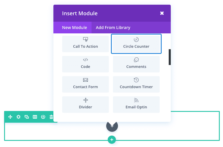
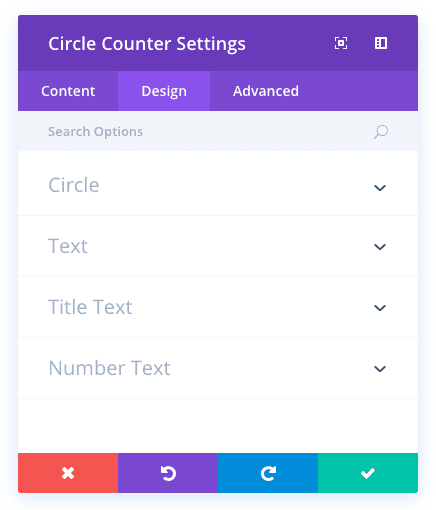
Locate the circle counter module within the list of modules and click it to add it to your page. The module list is searchable, which means you can also type the word “circle counter” and then click enter to automatically find and add the circle counter module! Once the module has been added, you will be greeted with the module’s list of options. These options are separated into three main groups: Content, Design and Advanced.
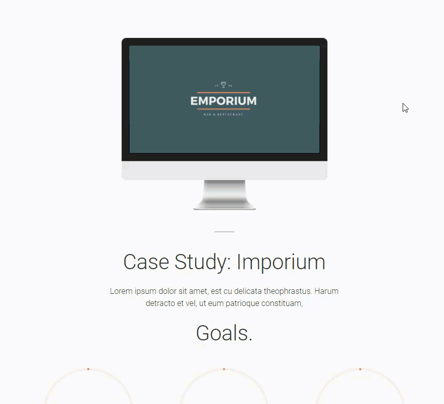
Use Case Example: Using the Circle Counter Module to Display Project Goals in a Case Study
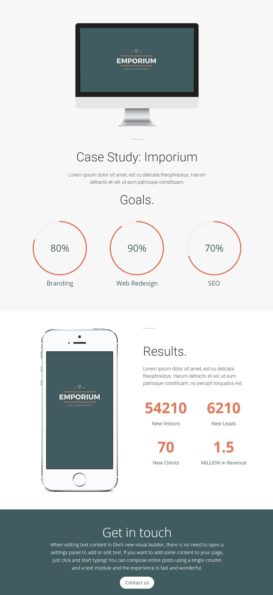
One great ways to use the Circle Counters Module is to illustrate stats for case studies or portfolio items. Simply label each circle counter with a certain project feature or goal so the user knows what services where included in the project. In this example, I’m adding using the Circle Counter Module to display three project Goals.
As you can see in the image below, the top of the page includes the three project goals using the Bar Counter Module and the bottom of the page includes the results of the case study using the Number Counter Module.
Let’s get started.
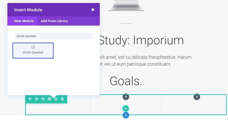
Use the visual builder to add a Standard Section with a fullwidth (1 column) layout. Then add a Circle Counter Module to the row.
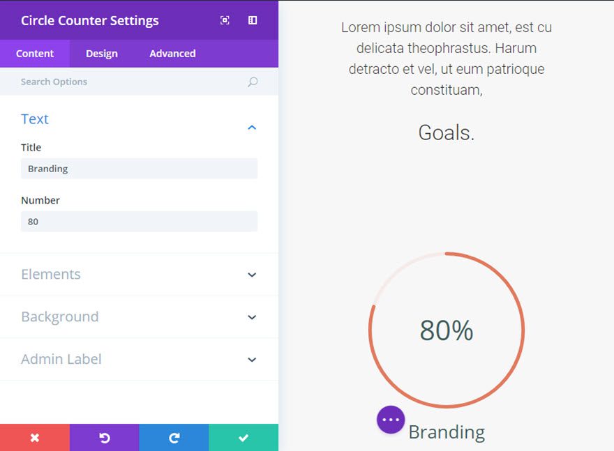
Update the Circle Counter Settings as follows:
Content Options
Title: Branding
Number: 80
Percent Sign: ON
Bar Background Color: #e07a5e
Design Options
Circle Color: #e07a5e
Text Color: Dark
Title font: default
Title Font Size: 26px
Title Text Color: #405c60
Number Font: Default
Number Font Size: 46px
Number Text color: #405c60
Save Settings
Now duplicate the Circle Counter Module twice and drag each duplicate to the second and third columns in your row.
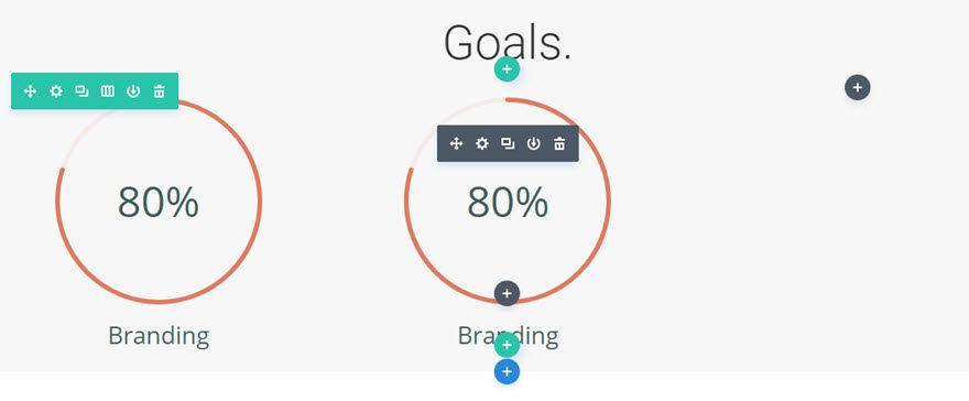
Since your design elements have carried over to the duplicate modules, all you need to do is update the Title, and Number of the Circle Counter.
That’s it!
Check out the page.
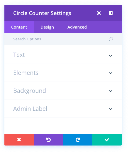
Circle Counter Content Options
Within the content tab you will find all of the module’s content elements, such as text, images and icons. Anything that controls what appears in your module will always be found within this tab.
Title
Input a title for the circle counter. This is typically a word that represents that statistic that you are displaying. It will be displayed below the number within the circle graph.
Number
Define a number for the circle counter. Picking a number bellow 100 will cause the circle graph to fill up to a percent that equals the number you entered. For example, entering the number 20 will cause the circle to fill up 20% of the way with your accent color.
Percent Sign
Here you can choose whether the percent sign should be added after the number set above.
Bar Background Color
This will change the fill color for the bar. The fill color amount is controlled by the “number” selected above. If you select the number 50, and a color of Blue, then your circle will fill up 50% of the way with a blue color.
Admin Label
This will change the label of the module in the builder for easy identification. When using WireFrame view in the Visual Builder, these labels will appear within the module block in the Divi Builder interface.
Circle Counter Design Options
Within the design tab you will find all of the module’s styling options, such as fonts, colors, sizing and spacing. This is the tab you will use to change how your module looks. Every Divi module has a long list of design settings that you can use to change just about anything.
Circle Color
This is the color that will be used for the unfilled part of the circle (the negative space that is not filled by the Bar Background Color defined in the Content tab).
Circle Color Opacity
You can reduce the opacity of the filled part of the circle using this setting.
Text Color
Here you can choose whether your text should be light or dark. If you are working with a dark background, then your text should be light. If your background is light, then your text should be set to dark.
Title Font
You can change the font of your title text by selecting your desired font from the dropdown menu. Divi comes with dozens of great fonts powered by Google Fonts. By default, Divi uses the Open Sans font for all text on your page. You can also customize the style of your text using the bold, italic, all-caps and underline options.
Title Font Size
Here you can adjust the size of your title text. You can drag the range slider to increase or decrease the size of your text, or you can input your desired text size value directly into the input field to the right of the slider. The input fields supports different units of measurement, which means you can input “px” or “em” following your size value to change its unit type.
Title Text Color
By default, all text colors in Divi will appear as white or dark gray. If you would like to change the color of your title text, choose your desired color from the color picker using this option.
Title Letter Spacing
Letter spacing affects the space between each letter. If you would like to increase the space between each letter in your title text, use the range slider to adjust the space or input your desired spacing size into the input field to the right of the slider. The input fields supports different units of measurement, which means you can input “px” or “em” following your size value to change its unit type.
Title Line Height
Line height affects the space between each line of your title text If you would like to increase the space between each line, use the range slider to adjust the space or input your desired spacing size into the input field to the right of the slider. The input fields supports different units of measurement, which means you can input “px” or “em” following your size value to change its unit type.
Number Font
You can change the font of your number text by selecting your desired font from the dropdown menu. Divi comes with dozens of great fonts powered by Google Fonts. By default, Divi uses the Open Sans font for all text on your page. You can also customize the style of your text using the bold, italic, all-caps and underline options.
Number Font Size
Here you can adjust the size of your number text. You can drag the range slider to increase or decrease the size of your text, or you can input your desired text size value directly into the input field to the right of the slider. The input fields supports different units of measurement, which means you can input “px” or “em” following your size value to change its unit type.
Number Text Color
By default, all text colors in Divi will appear as white or dark gray. If you would like to change the color of your number text, choose your desired color from the color picker using this option.
Number Letter Spacing
Letter spacing affects the space between each letter. If you would like to increase the space between each letter in your number text, use the range slider to adjust the space or input your desired spacing size into the input field to the right of the slider. The input fields supports different units of measurement, which means you can input “px” or “em” following your size value to change its unit type.
Number Line Height
Line height affects the space between each line of your number text If you would like to increase the space between each line, use the range slider to adjust the space or input your desired spacing size into the input field to the right of the slider. The input fields supports different units of measurement, which means you can input “px” or “em” following your size value to change its unit type.
Circle Counter Advanced Options
Within the advanced tab, you will find options that more experienced web designers might find useful, such as custom CSS and HTML attributes. Here you can apply custom CSS to any of the module’s many elements. You can also apply custom CSS classes and IDs to the module, which can be used to customize the module within your child theme’s style.css file.
CSS ID
Enter an optional CSS ID to be used for this module. An ID can be used to create custom CSS styling, or to create links to particular sections of your page.
CSS Class
Enter optional CSS classes to be used for this module. A CSS class can be used to create custom CSS styling. You can add multiple classes, separated with a space. These classes can be used in your Divi Child Theme or within the Custom CSS that you add to your page or your website using the Divi Theme Options or Divi Builder Page Settings.
Custom CSS
Custom CSS can also be applied to the module and any of the module’s internal elements. Within the Custom CSS section, you will find a text field where you can add custom CSS directly to each element. CSS input into these settings are already wrapped within style tags, so you need only enter CSS rules separated by semicolons.
Visibility
This option lets you control which devices your module appears on. You can choose to disable your module on tablets, smart phones or desktop computers individually. This is useful if you want to use different modules on different devices, or if you want to simplify the mobile design by eliminating certain elements from the page.