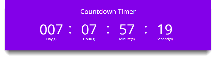
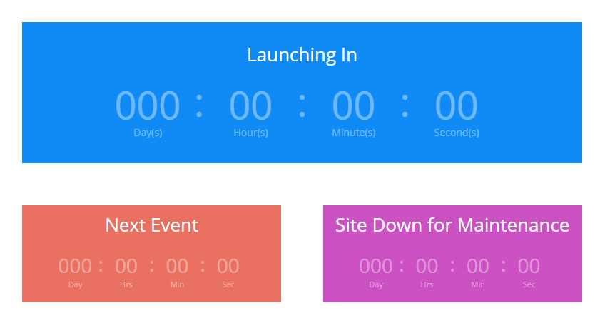
The Countdown Timer module creates a visual timer that counts down to a specific date. This is great for creating a “coming soon” page to builds anticipation for a new product or service. When combined with a “blank page,” this can also be used as a great “coming soon” landing page/maintenance mode page.
It is important to be able to let your visitors know when something is going to be launched or an event is going to occur. Simply set the date and time to count down to and wait for the big day.
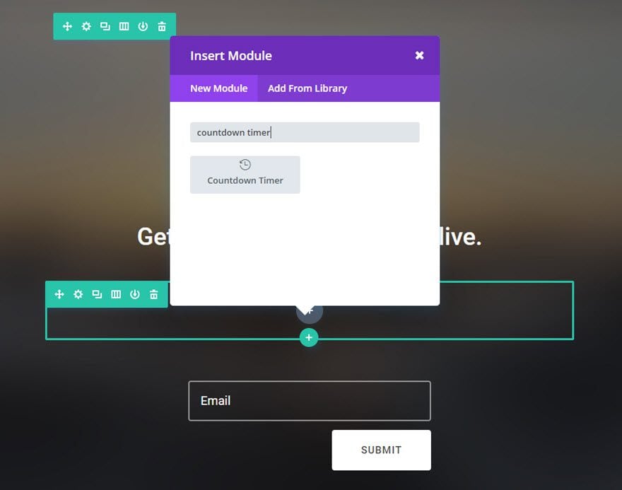
How To Add A Countdown Timer Module To Your Page
Before you can add a countdown timer module to your page, you will first need to jump into the Divi Builder. Once the Divi Theme has been installed on your website, you will notice a Use Divi Builder button above the post editor every time you are building a new page. Clicking this button will enable the Divi Builder, giving you access to all of the Divi Builder’s modules. Next, click the Use Visual Builder button to launch the builder in Visual Mode. You can also click the Use Visual Builder button when browsing your website on the front end if you are logged in to your WordPress Dashboard.

Once you have entered the Visual Builder, you can click the gray plus button to add a new module to your page. New modules can only be added inside of Rows. If you are starting a new page, don’t forget to add a row to your page first. We have some great tutorials about how to use Divi’s row and section elements.
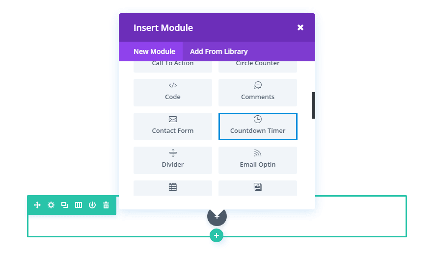
Locate the countdown timer module within the list of modules and click it to add it to your page. The module list is searchable, which means you can also type the word “countdown timer” and then click enter to automatically find and add the countdown timer module! Once the module has been added, you will be greeted with the module’s list of options. These options are separated into three main groups: Content, Design and Advanced.
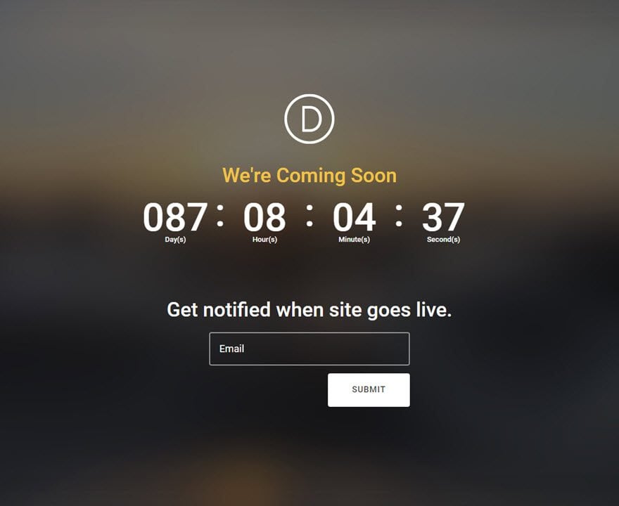
Use Case Example: Adding a Countdown Timer to a Coming Soon Page.
For this example, I’m going to show you how to add a Countdown Timer Module to a Coming Soon page when launching a new product. The countdown timer adds an element of anticipation. This combined with an email optin or contact form will help you stay top of mind with your visitors before the product launch.
Let’s get started.
Use the visual builder to add a Regular Section with a fullwidth (1 column) row. Then add a Countdown Timer Module to the row.
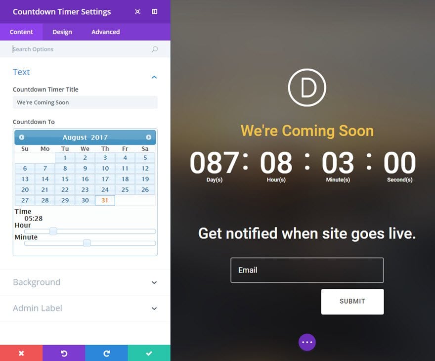
Update the Countdown Timer Settings as follows:
Content tab
Countdown Timer Title: We’re Coming Soon
Countdown To: [enter date and time of the launch]
Use Background Color: NO
Design tab
Header Font: Roboto
Header Font Size: 36px
Header Text Color: #f1c346
Numbers Font: Roboto
Numbers Font Size: Desktop 70px, Tablet 55px, Smartphone 35px
Label Font: Roboto
Label Font Size: 13
Label Text Color: #ffffff
Lable Line Height: 20px
Custom Padding: 38px Top, 38px Bottom
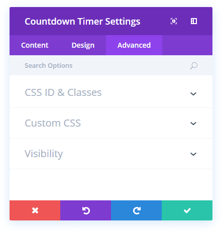
Advanced tab
Custom CSS (Main Element): font-weight: 500;
That’s it!
Countdown Timer Content Options
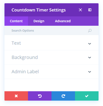
Countdown Timer Title
This is the title displayed for the countdown timer.
Countdown To
This option allows you to select the date and time of the event you want to countdown to. Once selected, you countdown timer will automatically begin counting down to this point in time. Your countdown timer is based on your timezone settings in your WordPress General Settings.
Background Color
Here you can choose a background color for your countdown timer module.
Background Image
Here you can choose a background image for countdown timer module.
Admin Label
By default, your countdown module will appear with a label that reads ‘Countdown Timer’ in the builder. The Admin Label allows you to change this label for easy identification.
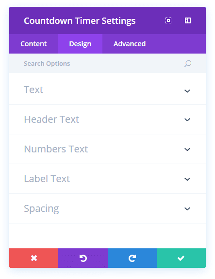
Countdown Timer Design Options
Text Color
Here you can choose whether your text should be light or dark. If you are working with a dark background, then your text should be light. If your background is light, then your text should be set to dark.
Header Font
You can change the font of your Header text by selecting your desired font from the dropdown menu. Divi comes with dozens of great fonts powered by Google Fonts. By default, Divi uses the Open Sans font for all text on your page. You can also customize the style of your text using the bold, italic, all-caps and underline options.
Header Font Size
Here you can adjust the size of your Header text. You can drag the range slider to increase or decrease the size of your text, or you can input your desired text size value directly into the input field to the right of the slider. The input fields supports different units of measurement, which means you can input “px” or “em” following your size value to change its unit type.
Header Text Color
By default, all text colors in Divi will appear as white or dark gray. If you would like to change the color of your Header text, choose your desired color from the color picker using this option.
Header Letter Spacing
Letter spacing affects the space between each letter. If you would like to increase the space between each letter in your Header text, use the range slider to adjust the space or input your desired spacing size into the input field to the right of the slider. The input fields supports different units of measurement, which means you can input “px” or “em” following your size value to change its unit type.
Header Line Height
Line height affects the space between each line of your Header text If you would like to increase the space between each line, use the range slider to adjust the space or input your desired spacing size into the input field to the right of the slider. The input fields supports different units of measurement, which means you can input “px” or “em” following your size value to change its unit type.
Numbers Font
You can change the font of your Numbers text by selecting your desired font from the dropdown menu. Divi comes with dozens of great fonts powered by Google Fonts. By default, Divi uses the Open Sans font for all text on your page. You can also customize the style of your text using the bold, italic, all-caps and underline options.
Numbers Font Size
Here you can adjust the size of your Numbers text. You can drag the range slider to increase or decrease the size of your text, or you can input your desired text size value directly into the input field to the right of the slider. The input fields supports different units of measurement, which means you can input “px” or “em” following your size value to change its unit type.
Numbers Text Color
By default, all text colors in Divi will appear as white or dark gray. If you would like to change the color of your Numbers text, choose your desired color from the color picker using this option.
Numbers Letter Spacing
Letter spacing affects the space between each letter. If you would like to increase the space between each letter in your Numbers text, use the range slider to adjust the space or input your desired spacing size into the input field to the right of the slider. The input fields supports different units of measurement, which means you can input “px” or “em” following your size value to change its unit type.
Numbers Line Height
Line height affects the space between each line of your Numbers text If you would like to increase the space between each line, use the range slider to adjust the space or input your desired spacing size into the input field to the right of the slider. The input fields supports different units of measurement, which means you can input “px” or “em” following your size value to change its unit type.
Label Font
You can change the font of your Label text by selecting your desired font from the dropdown menu. Divi comes with dozens of great fonts powered by Google Fonts. By default, Divi uses the Open Sans font for all text on your page. You can also customize the style of your text using the bold, italic, all-caps and underline options.
Label Font Size
Here you can adjust the size of your Label text. You can drag the range slider to increase or decrease the size of your text, or you can input your desired text size value directly into the input field to the right of the slider. The input fields supports different units of measurement, which means you can input “px” or “em” following your size value to change its unit type.
Label Text Color
By default, all text colors in Divi will appear as white or dark gray. If you would like to change the color of your Label text, choose your desired color from the color picker using this option.
Label Letter Spacing
Letter spacing affects the space between each letter. If you would like to increase the space between each letter in your Label text, use the range slider to adjust the space or input your desired spacing size into the input field to the right of the slider. The input fields supports different units of measurement, which means you can input “px” or “em” following your size value to change its unit type.
Label Line Height
Line height affects the space between each line of your Label text If you would like to increase the space between each line, use the range slider to adjust the space or input your desired spacing size into the input field to the right of the slider. The input fields supports different units of measurement, which means you can input “px” or “em” following your size value to change its unit type.
Custom Margin
Margin is the space added outside of your module, between the module and the next element above, below or to the left and right of it. You can add custom margin values to any of the module’s four sides. To remove custom margin, delete the added value from the input field. By default these values are measured in pixels, but you can input custom units of measurement into the input fields.
Custom Padding
Padding is the space added inside of your module, between the edge of the module and its internal elements. You can add custom padding values to any of the module’s four sides. To remove custom margin, delete the added value from the input field. By default these values are measured in pixels, but you can input custom units of measurement into the input fields.
Countdown Timer Advanced Options
CSS ID
Enter an optional CSS ID to be used for this module. An ID can be used to create custom CSS styling, or to create links to particular sections of your page.
CSS Class
Enter optional CSS classes to be used for this module. A CSS class can be used to create custom CSS styling. You can add multiple classes, separated with a space. These classes can be used in your Divi Child Theme or within the Custom CSS that you add to your page or your website using the Divi Theme Options or Divi Builder Page Settings.
Custom CSS
Custom CSS can also be applied to the module and any of the module’s internal elements. Within the Custom CSS section, you will find a text field where you can add custom CSS directly to each element. CSS input into these settings are already wrapped within style tags, so you need only enter CSS rules separated by semicolons.
Visibility
This option lets you control which devices your module appears on. You can choose to disable your module on tablets, smart phones or desktop computers individually. This is useful if you want to use different modules on different devices, or if you want to simplify the mobile design by eliminating certain elements from the page.