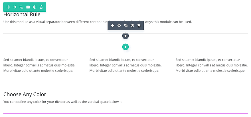
The divider module is perfect for creating either a horizontal line rule, custom vertical spacing, or both. Using this element is great for adding structure and organization to your site.
VIEW A LIVE DEMO OF THIS MODULE
How To Add A Divider Module To Your Page
Before you can add a divider module to your page, you will first need to jump into the Divi Builder. Once the Divi Theme has been installed on your website, you will notice a Use Divi Builder button above the post editor every time you are building a new page. Clicking this button will enable the Divi Builder, giving you access to all of the Divi Builder’s modules. Next, click the Use Visual Builder button to launch the builder in Visual Mode. You can also click the Use Visual Builder button when browsing your website on the front end if you are logged in to your WordPress Dashboard.

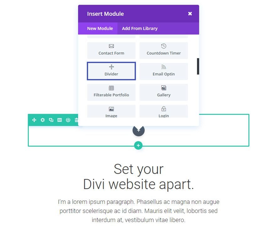
Once you have entered the Visual Builder, you can click the gray plus button to add a new module to your page. New modules can only be added inside of Rows. If you are starting a new page, don’t forget to add a row to your page first. We have some great tutorials about how to use Divi’s row and section elements.
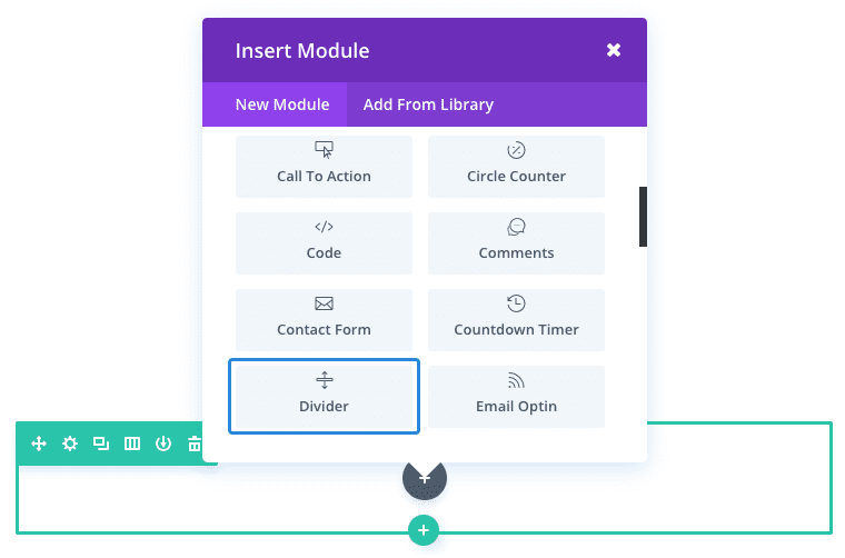
Locate the divider module within the list of modules and click it to add it to your page. The module list is searchable, which means you can also type the word “divider” and then click enter to automatically find and add the divider module! Once the module has been added, you will be greeted with the module’s list of options. These options are separated into three main groups: Content, Design and Advanced.
Use Case Example: Add a custom Divider line above section headers on a page.
Adding a stylized divider line to a webpage using the Divi Divider Module is a convenient solution for framing your sections and making your header look great.
For this example I’m going to show you how to add a minimal divider line above a section header that is 4px thick and 50px wide. The small line does two things. First, it adds an element of design above your headers which make them look better. And second, the divider line separates the section, framing it for better readability.
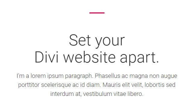
Here you can see the small pink divider implemented throughout the webpage.

Now I’m going to show you how to add this small divider line above one of the headers.
Using the Visual Builder, add a new 1 column row above (or before) the section header. Then add the Divider Module to that row.
Update the Divider Settings as follows:
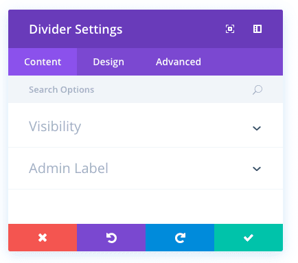
Content Options
Visibility: Show Divider
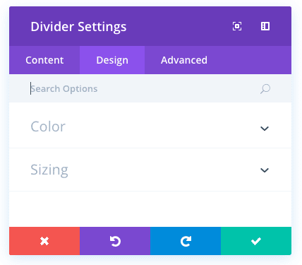
Design Options
Color: #ea1d63 (pink)
Divider Position: Vertically Centered
Divider Weight: 4px
Height: 4
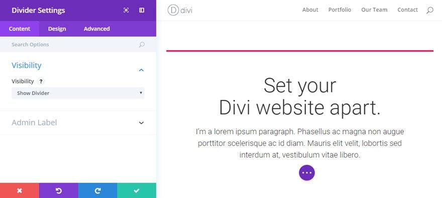
Save Settings
Now go back and edit the row settings you created for the Divider Module. Under the Design tab of the Row Module Settings, change “Use Custom Width” to YES and set the Custom Width option to 50px.
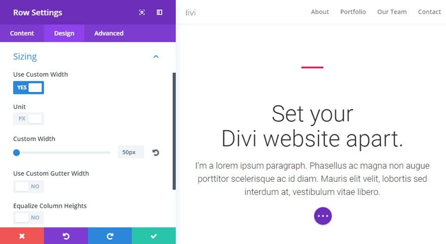
This will make sure your row the contains your Divider will only be 50px wide and remain centered on the page.
Now your section header has a subtle divider that adds a nice design element.
You can then repeat this process for all of the section headers on your page.
Divider Content Options
Within the content tab you will find all of the module’s content elements, such as text, images and icons. Anything that controls what appears in your module will always be found within this tab.
Visibility
Choose to not show the divider if you only want to add vertical spacing. If you choose to display the divider, the rule will appear at the top of the module, but will not affect the height that you specify below.
Admin Label
This will change the label of the module in the builder for easy identification. When using WireFrame view in the Visual Builder, these labels will appear within the module block in the Divi Builder interface.
Divider Design Options
Within the design tab you will find all of the module’s styling options, such as fonts, colors, sizing and spacing. This is the tab you will use to change how your module looks. Every Divi module has a long list of design settings that you can use to change just about anything.
Color
Choose the color of the 1px divider line that will be created with this module. The horizontal rule will span the full width of the column that it is in.
Height
Define how much vertical space you would like your divider module to create (in pixels).
Divider Advanced Options
Within the advanced tab, you will find options that more experienced web designers might find useful, such as custom CSS and HTML attributes. Here you can apply custom CSS to any of the module’s many elements. You can also apply custom CSS classes and IDs to the module, which can be used to customize the module within your child theme’s style.css file.
CSS ID
Enter an optional CSS ID to be used for this module. An ID can be used to create custom CSS styling, or to create links to particular sections of your page.
CSS Class
Enter optional CSS classes to be used for this module. A CSS class can be used to create custom CSS styling. You can add multiple classes, separated with a space. These classes can be used in your Divi Child Theme or within the Custom CSS that you add to your page or your website using the Divi Theme Options or Divi Builder Page Settings.
Custom CSS
Custom CSS can also be applied to the module and any of the module’s internal elements. Within the Custom CSS section, you will find a text field where you can add custom CSS directly to each element. CSS input into these settings are already wrapped within style tags, so you need only enter CSS rules separated by semicolons.
Visibility
This option lets you control which devices your module appears on. You can choose to disable your module on tablets, smart phones or desktop computers individually. This is useful if you want to use different modules on different devices, or if you want to simplify the mobile design by eliminating certain elements from the page.