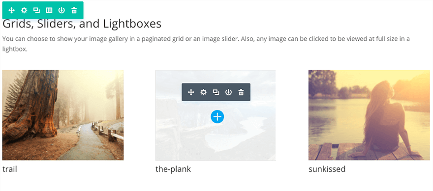
Sharing a collection of images is always a great way to visually engage users in your content. The Gallery module lets you create and organize galleries anywhere on your website. The Divi Builder gallery module comes in both grid and slider format and supports large galleries with pagination.
VIEW A LIVE DEMO OF THIS MODULE
How To Add A Gallery Module To Your Page
Before you can add a gallery module to your page, you will first need to jump into the Divi Builder. Once the Divi Theme has been installed on your website, you will notice a Use Divi Builder button above the post editor every time you are building a new page. Clicking this button will enable the Divi Builder, giving you access to all of the Divi Builder’s modules. Next, click the Use Visual Builder button to launch the builder in Visual Mode. You can also click the Use Visual Builder button when browsing your website on the front end if you are logged in to your WordPress Dashboard.

Once you have entered the Visual Builder, you can click the gray plus button to add a new module to your page. New modules can only be added inside of Rows. If you are starting a new page, don’t forget to add a row to your page first. We have some great tutorials about how to use Divi’s row and section elements.
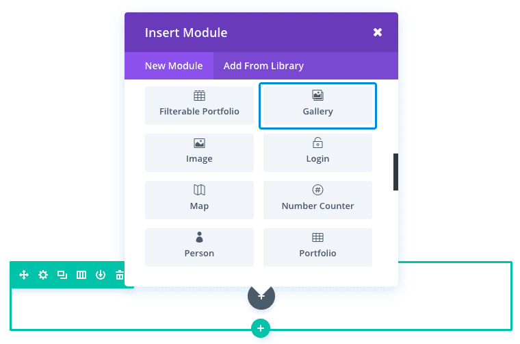
Locate the gallery module within the list of modules and click it to add it to your page. The module list is searchable, which means you can also type the word “gallery” and then click enter to automatically find and add the gallery module! Once the module has been added, you will be greeted with the module’s list of options. These options are separated into three main groups: Content, Design and Advanced.
Use Case Example: Adding a Fullwidth Image Gallery to Showcase Photography.
Adding a Gallery to your photography page is a great way to promote your work and increase credibility with clients. In this example, I’m going to show you how you can use the gallery module to add an image gallery with a grid layout that stretches the full width of the page. The images have no spacing between them which gives it a practical and aesthetic presentation.
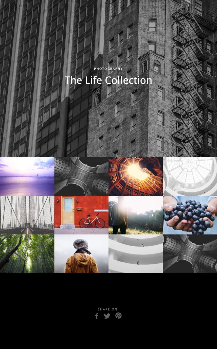
And let’s not forget that each image opens a lightbox popup to scroll through larger versions of the images in the gallery.
Using the Visual Builder, add a new section under the header section with a fullwidth (1 column) row. Then add the Gallery Module to the row.
Update the Gallery Module Settings as follows:
Content Options
Gallery Images: Click updated gallery an select the images you want to include in the gallery.
Images Number: 12
Show Title and Caption: NO
Show Pagination: NO
Design Options
Layout: Grid
Thumbnail Orientation: Landscape
Zoom Icon Color: #ffffff
Hover Overlay Color: rgba(0,0,0,0.48)
Hover Icon Picker: default
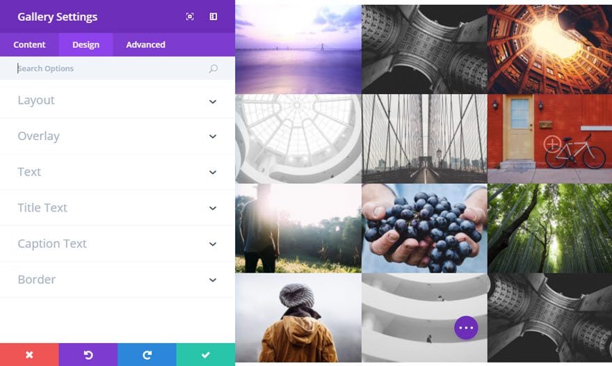
Save Settings
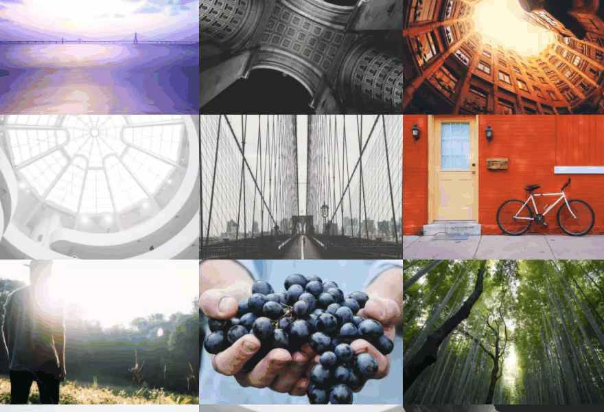
Now all that is left to do is get rid of all the space around the images. Go back and select row settings. Under the Design tab update the following:
Make This Row Fullwidth: YES
Use Custom Gutter Width: YES
Gutter Width: 1
It is important to remember that the number value “1” for gutter width is really zero (no width at all).
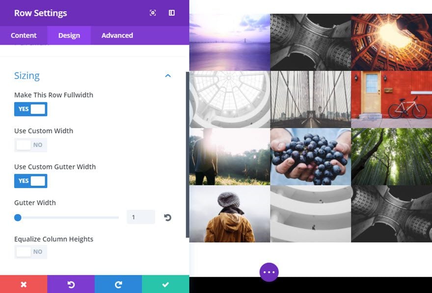
Save Settings
That’s it!
Gallery Content Options
Within the content tab you will find all of the module’s content elements, such as text, images and icons. Anything that controls what appears in your module will always be found within this tab.
Gallery Images
Click the Update Gallery button to launch the WordPress media library where you can choose which images you would like to display in your gallery.
Images Number
Define the number of images that should be displayed per page. When more images than are allowed on each page are included in your gallery, pagination will appear below the images.
Show Title and Caption:
If an image title or caption has been added, they will appear below the image in the gallery. If you would like to disable these text elements then you can do so using this option.
Show Pagination
When more images than are allowed on each page are included in your gallery, pagination will appear below the images. If you would like to remove pagination, you can disable this setting.
Admin Label
This will change the label of the module in the builder for easy identification. When using WireFrame view in the Visual Builder, these labels will appear within the module block in the Divi Builder interface.
Gallery Design Options
Within the design tab you will find all of the module’s styling options, such as fonts, colors, sizing and spacing. This is the tab you will use to change how your module looks. Every Divi module has a long list of design settings that you can use to change just about anything.
Layout
By default, galleries are displayed as a grid of images. You can also choose to display your gallery in the form of an image slider.
Thumbnail Orientation
You can choose to have your galleries images formatted as portrait or landscape. If you are switching modes, you may need to regenerate your thumbnails.
Zoom Icon Color
When hovering over an item within the gallery module, an overlay icon appears. You can adjust the color that is used from this icon using the color picker in this setting.
Hover Overlay Color
When hovering over an item within the gallery module, an overlay color fades in on top of the image and below the portfolio’s title text and icon. By default, a semi-transparent white color is used. If you would like to use a different color, you can adjust the color using the color picker in this setting
Hover Icon Picker
Here you can choose a custom icon to be displayed when a visitor hovers over gallery items within the module.
Text Color
Here you can choose whether your text should be light or dark. If you are working with a dark background, then your text should be light. If your background is light, then your text should be set to dark.
Title Font
You can change the font of your title text by selecting your desired font from the dropdown menu. Divi comes with dozens of great fonts powered by Google Fonts. By default, Divi uses the Open Sans font for all text on your page. You can also customize the style of your text using the bold, italic, all-caps and underline options.
Title Font Size
Here you can adjust the size of your title text. You can drag the range slider to increase or decrease the size of your text, or you can input your desired text size value directly into the input field to the right of the slider. The input fields supports different units of measurement, which means you can input “px” or “em” following your size value to change its unit type.
Title Text Color
By default, all text colors in Divi will appear as white or dark gray. If you would like to change the color of your title text, choose your desired color from the color picker using this option.
Title Letter Spacing
Letter spacing affects the space between each letter. If you would like to increase the space between each letter in your title text, use the range slider to adjust the space or input your desired spacing size into the input field to the right of the slider. The input fields supports different units of measurement, which means you can input “px” or “em” following your size value to change its unit type.
Title Line Height
Line height affects the space between each line of your title text If you would like to increase the space between each line, use the range slider to adjust the space or input your desired spacing size into the input field to the right of the slider. The input fields supports different units of measurement, which means you can input “px” or “em” following your size value to change its unit type.
Caption Font
You can change the font of your caption text by selecting your desired font from the dropdown menu. Divi comes with dozens of great fonts powered by Google Fonts. By default, Divi uses the Open Sans font for all text on your page. You can also customize the style of your text using the bold, italic, all-caps and underline options.
Caption Font Size
Here you can adjust the size of your caption text. You can drag the range slider to increase or decrease the size of your text, or you can input your desired text size value directly into the input field to the right of the slider. The input fields supports different units of measurement, which means you can input “px” or “em” following your size value to change its unit type.
Caption Text Color
By default, all text colors in Divi will appear as white or dark gray. If you would like to change the color of your caption text, choose your desired color from the color picker using this option.
Caption Letter Spacing
Letter spacing affects the space between each letter. If you would like to increase the space between each letter in your caption text, use the range slider to adjust the space or input your desired spacing size into the input field to the right of the slider. The input fields supports different units of measurement, which means you can input “px” or “em” following your size value to change its unit type.
Caption Line Height
Line height affects the space between each line of your caption text If you would like to increase the space between each line, use the range slider to adjust the space or input your desired spacing size into the input field to the right of the slider. The input fields supports different units of measurement, which means you can input “px” or “em” following your size value to change its unit type.
Use Border
Enabling this option will place a border around your module. This border can be customized using the following conditional settings.
Border Color
This option affects the color of your border. Select a custom color from the color picker to apply it to your border.
Border Width
By default, borders have a width of 1 pixel. You can increase this value by dragging the range slider or by inputting a custom value into the input field to the right of the slider. Custom units of measurements of supported, which means you can change the default unit from “px” to something else, such as em, vh, vw etc.
Border Style
Borders support eight different styles, including: solid, dotted, dashed, double, groove, ridge, inset and outset. Select your desired style from the dropdown menu to apply it to your border.
Gallery Advanced Options
Within the advanced tab, you will find options that more experienced web designers might find useful, such as custom CSS and HTML attributes. Here you can apply custom CSS to any of the module’s many elements. You can also apply custom CSS classes and IDs to the module, which can be used to customize the module within your child theme’s style.css file.
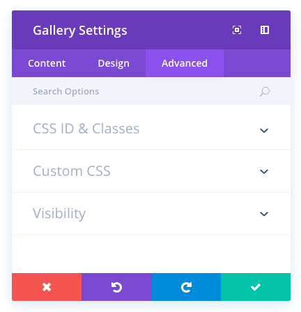
CSS ID
Enter an optional CSS ID to be used for this module. An ID can be used to create custom CSS styling, or to create links to particular sections of your page.
CSS Class
Enter optional CSS classes to be used for this module. A CSS class can be used to create custom CSS styling. You can add multiple classes, separated with a space. These classes can be used in your Divi Child Theme or within the Custom CSS that you add to your page or your website using the Divi Theme Options or Divi Builder Page Settings.
Custom CSS
Custom CSS can also be applied to the module and any of the module’s internal elements. Within the Custom CSS section, you will find a text field where you can add custom CSS directly to each element. CSS input into these settings are already wrapped within style tags, so you need only enter CSS rules separated by semicolons.
Visibility
This option lets you control which devices your module appears on. You can choose to disable your module on tablets, smart phones or desktop computers individually. This is useful if you want to use different modules on different devices, or if you want to simplify the mobile design by eliminating certain elements from the page.