How To Add A Post Slider Module To Your Page
Before you can add a post slider module to your page, you will first need to jump into the Divi Builder. Once the Divi Theme has been installed on your website, you will notice a Use Divi Builder button above the post editor every time you are building a new page. Clicking this button will enable the Divi Builder, giving you access to all of the Divi Builder’s modules. Next, click the Use Visual Builder button to launch the builder in Visual Mode. You can also click the Use Visual Builder button when browsing your website on the front end if you are logged in to your WordPress Dashboard.

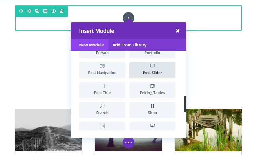
Once you have entered the Visual Builder, you can click the gray plus button to add a new module to your page. New modules can only be added inside of Rows. If you are starting a new page, don’t forget to add a row to your page first. We have some great tutorials about how to use Divi’s row and section elements.
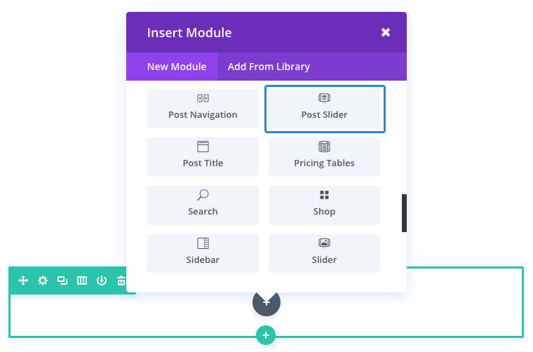
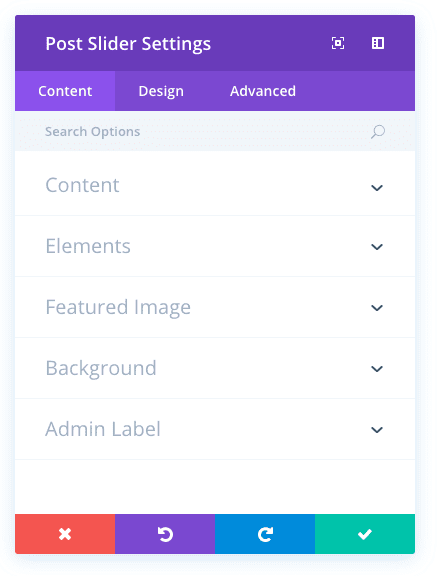
Locate the post slider module within the list of modules and click it to add it to your page. The module list is searchable, which means you can also type the word “post slider” and then click enter to automatically find and add the post slider module! Once the module has been added, you will be greeted with the module’s list of options. These options are separated into three main groups: Content, Design and Advanced.
Use Case Example: Add a Post Slider to a Blog Page to Showcase Recent Posts
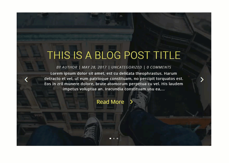
For this example I’m going to add a Post Slider to showcase the three most recent posts at the top of a blog page. Each slide will display the post’s featured image as a background image, the post title and post meta, as well as a read more button.
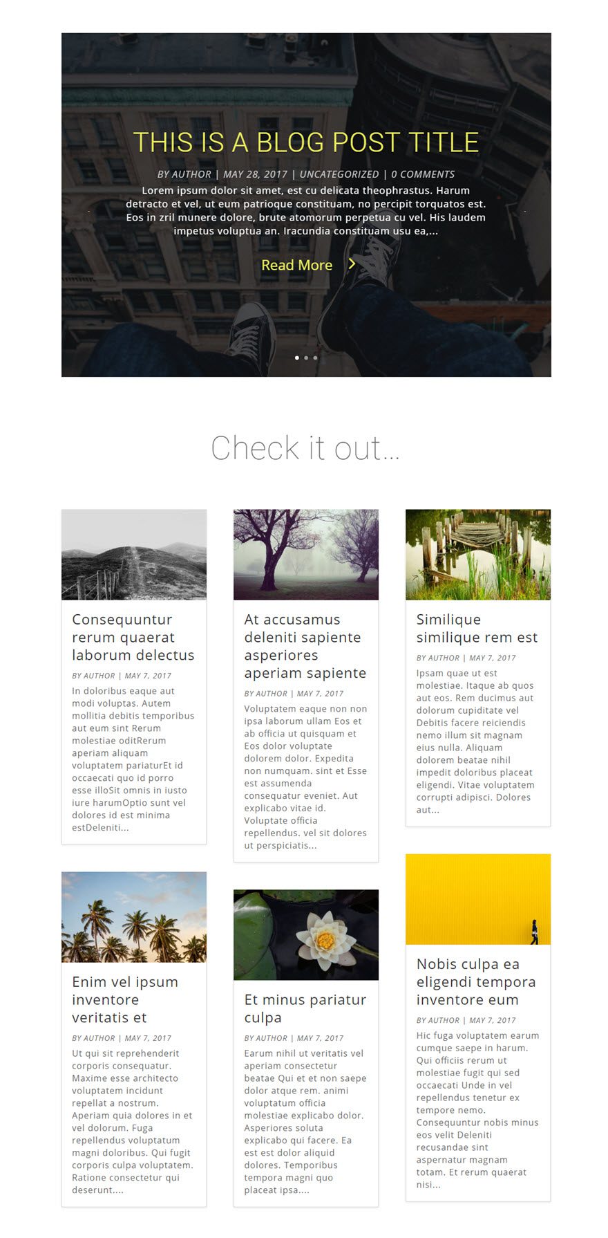
Using the Visual Builder, add a new Standard Section to the top of the blog page with a fullwidth (1 column) row. Then insert the Post Slider Module to your new row.
Under Post Slider Settings, update the following options:
Content Options
Posts Number: 3
Design Options
Header Font: Roboto (Uppercase)
header Font Size: 50px
Header Text Color: #edef5d
Header Letter Spacing: 1px
Body Font Size: 16
Body Letter Spacing: 1px
Body Line Height: 1.4em
Meta Font: Open Sans, Italic, Uppercase
Meta Font Size: 18px
Meta Text Color: #cccccc
Meta Line Height: 2em
Use Custom Styles for Button: YES
button Text Size: 26px
Button Text color: #edef5d
Button Border Width: 0px
Button Icon: >
Only Show Icon On Hover for Button: NO
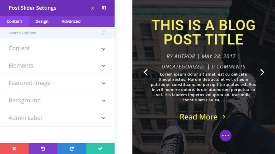
Save Settings
That’s it!
Post Slider Content Options
Within the content tab you will find all of the module’s content elements, such as text, images and icons. Anything that controls what appears in your module will always be found within this tab.
Posts Number
Choose how many posts you would like to display in the slider.
Include Categories
Choose which categories you would like to include in the slider.
Order By
Here you can adjust the order in which posts are displayed.
Button Text
Define the text which will be displayed on “Read More” button. leave blank for default ( Read More )
Content Display
Showing the full content will not truncate your posts in the slider. Showing the excerpt will only display excerpt text.
Use Post Excerpt If Defined
Disable this option if you want to ignore manually defined excerpts and always generate it automatically.
Automatic Excerpt Length
Define the length of automatically generated excerpts. Leave blank for default ( 270 )
Show Arrows
This setting will turn on and off the navigation arrows.
Show Controls
This setting will turn on and off the circle buttons at the bottom of the slider.
Show Read More Button
This setting will turn on and off the read more button.
Show Post Meta
This setting will turn on and off the meta section.
Show Featured Image
This setting will turn on and off the featured image in the slider.
Image Placement
Select how you would like to display the featured image in slides
Background Color
Use the color picker to choose a background color for this module.
Background Image
Upload your desired image, or type in the URL to the image you would like to use as the background for the slider.
Background Image Position
Choose the CSS positioning of the background image for each slide.
Background Image Size
Choose the CSS background image size used for each slide.
Admin Label
This will change the label of the module in the builder for easy identification. When using WireFrame view in the Visual Builder, these labels will appear within the module block in the Divi Builder interface.
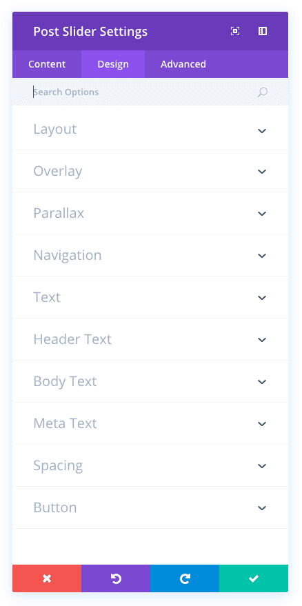
Post Slider Design Options
Within the design tab you will find all of the module’s styling options, such as fonts, colors, sizing and spacing. This is the tab you will use to change how your module looks. Every Divi module has a long list of design settings that you can use to change just about anything.
Remove Inner Shadow
This will remove the CSS inner shadow that it applied to all slides by default.
Use Background Overlay
When enabled, a custom overlay color will be added above your background image and behind your slider content.
Background Overlay Color
Use the color picker to choose a color for the background overlay.
Use Text Overlay
When enabled, a background color is added behind the slider text to make it more readable atop background images.
Text Overlay Border Radius
Border radius affects how rounded the corners of the text overlay box are. By default, the corners have a slightly rounded edge of 3 pixels. You can reduce this value to 0 to create a rectangular box or increase the value to make the corners even more rounded.
Use Parallax Effect
Enabling this option will give your background images a fixed position as you scroll.
Parallax Method
Here you can define the method used for the parallax effect – CSS or True Parallax.
Arrows Custom Color
When hovering over a slider module, arrows appear that allow the visitor the navigate through each slide. By default, these arrows inherit the slide’s main text color. However, you can define a custom color for these arrows using this setting.
Dot Nav Custom Color
Within each slider, dot navigation elements appear below the slider content. These items allow the user to navigate through the slider. You can define a custom color to be used for these elements using the color picker in this setting.
Text Color
Here you can choose whether your text is light or dark. If you have a slide with a dark background, then choose light text. If you
have a light background, then use dark text.
Header Font
You can change the font of your header text by selecting your desired font from the dropdown menu. Divi comes with dozens of great fonts powered by Google Fonts. By default, Divi uses the Open Sans font for all text on your page. You can also customize the style of your text using the bold, italic, all-caps and underline options.
Header Font Size
Here you can adjust the size of your header text. You can drag the range slider to increase or decrease the size of your text, or you can input your desired text size value directly into the input field to the right of the slider. The input fields supports different units of measurement, which means you can input “px” or “em” following your size value to change its unit type.
Header Text Color
By default, all text colors in Divi will appear as white or dark gray. If you would like to change the color of your header text, choose your desired color from the color picker using this option.
Header Letter Spacing
Letter spacing affects the space between each letter. If you would like to increase the space between each letter in your header text, use the range slider to adjust the space or input your desired spacing size into the input field to the right of the slider. The input fields supports different units of measurement, which means you can input “px” or “em” following your size value to change its unit type.
Header Line Height
Line height affects the space between each line of your header text If you would like to increase the space between each line, use the range slider to adjust the space or input your desired spacing size into the input field to the right of the slider. The input fields supports different units of measurement, which means you can input “px” or “em” following your size value to change its unit type.
Body Font
You can change the font of your body text by selecting your desired font from the dropdown menu. Divi comes with dozens of great fonts powered by Google Fonts. By default, Divi uses the Open Sans font for all text on your page. You can also customize the style of your text using the bold, italic, all-caps and underline options.
Body Font Size
Here you can adjust the size of your body text. You can drag the range slider to increase or decrease the size of your text, or you can input your desired text size value directly into the input field to the right of the slider. The input fields supports different units of measurement, which means you can input “px” or “em” following your size value to change its unit type.
Body Text Color
By default, all text colors in Divi will appear as white or dark gray. If you would like to change the color of your body text, choose your desired color from the color picker using this option.
Body Letter Spacing
Letter spacing affects the space between each letter. If you would like to increase the space between each letter in your body text, use the range slider to adjust the space or input your desired spacing size into the input field to the right of the slider. The input fields supports different units of measurement, which means you can input “px” or “em” following your size value to change its unit type.
Body Line Height
Line height affects the space between each line of your body text If you would like to increase the space between each line, use the range slider to adjust the space or input your desired spacing size into the input field to the right of the slider. The input fields supports different units of measurement, which means you can input “px” or “em” following your size value to change its unit type.
Meta Font
You can change the font of your meta text by selecting your desired font from the dropdown menu. Divi comes with dozens of great fonts powered by Google Fonts. By default, Divi uses the Open Sans font for all text on your page. You can also customize the style of your text using the bold, italic, all-caps and underline options.
Meta Font Size
Here you can adjust the size of your meta text. You can drag the range slider to increase or decrease the size of your text, or you can input your desired text size value directly into the input field to the right of the slider. The input fields supports different units of measurement, which means you can input “px” or “em” following your size value to change its unit type.
Meta Text Color
By default, all text colors in Divi will appear as white or dark gray. If you would like to change the color of your meta text, choose your desired color from the color picker using this option.
Meta Letter Spacing
Letter spacing affects the space between each letter. If you would like to increase the space between each letter in your meta text, use the range slider to adjust the space or input your desired spacing size into the input field to the right of the slider. The input fields supports different units of measurement, which means you can input “px” or “em” following your size value to change its unit type.
Meta Line Height
Line height affects the space between each line of your meta text If you would like to increase the space between each line, use the range slider to adjust the space or input your desired spacing size into the input field to the right of the slider. The input fields supports different units of measurement, which means you can input “px” or “em” following your size value to change its unit type.
Top Padding
This setting controls the inner space between top of the module and the text content within the module. If you would like to increase or decrease this space, input your desired value here. For example, to reduce the space and the overall size of the slider, you could enter a value of 100px. Alternatively, you could enter a percentage value, such as 10%, to make the height more dynamic.
Bottom Padding
This setting controls the inner space between bottom of the module and the text content within the module. If you would like to increase or decrease this space, input your desired value here. For example, to reduce the space and the overall size of the slider, you could enter a value of 100px. Alternatively, you could enter a percentage value, such as 10%, to make the height more dynamic.
Use Custom Styles for Button
Enabling this option will reveal various button customization settings that you can use to change the appearance of your module’s button.
Button Text Size
This setting can be used to increase or decrease the size of the text within the button. The button will scale as the text size is increased and decreased.
Button Text Color
By default, buttons assume your theme accent color as defined in the Theme Customizer. This option allows you to assign a custom text color to the button in this module. Select your custom color using the color picker to change the button’s color.
Button Background Color
By default, buttons have a transparent background color. This can be changed by selected your desired background color from the color picker.
Button Border Width
All Divi buttons have a 2px border by default. This border can be increased or decreased in size using this setting. Borders can be removed by inputting a value of 0.
Button Border Color
By default, button borders assume your theme accent color as defined in the Theme Customizer. This option allows you to assign a custom border color to the button in this module. Select your custom color using the color picker to change the button’s border color.
Button Border Radius
Border radius affects how rounded the corners of your buttons are. By default, buttons in Divi has a small border radius that rounds the corners by 3 pixels. You can decrease this to 0 to create a square button or increase it significantly to create buttons with circular edges.
Button Letter Spacing
Letter spacing affects the space between each letter. If you would like to increase the space between each letter in your button text, use the range slider to adjust the space or input your desired spacing size into the input field to the right of the slider. The input fields supports different units of measurement, which means you can input “px” or “em” following your size value to change its unit type.
Button Font
You can change the font of your button text by selecting your desired font from the dropdown menu. Divi comes with dozens of great fonts powered by Google Fonts. By default, Divi uses the Open Sans font for all text on your page. You can also customize the style of your text using the bold, italic, all-caps and underline options.
Add Button Icon
Disabled this setting will remove icons from your button. By default, all Divi buttons display an arrow icon on hover.
Button Icon
If icons are enabled, you can use this setting to pick which icon to use in your button. Divi has various icons to choose from.
Button Icon Color
Adjusting this setting will change the color of the icon that appears in your button. By default, the icon color is the same as your buttons’ text color, but this setting allows you to adjust the color independently.
Button Icon Placement
You can choose to have your button icon display on the left or the right side of your button.
Only Show Icon On Hover for Button
By default, button icons are only displayed on hover. If you would like the icon to always appear, disable this setting.
Button Hover Text Color
When the button is hovered over by a visitor’s mouse, this color will be used. The color will transition from the base color defined in the previous settings.
Button Hover Background Color
When the button is hovered over by a visitor’s mouse, this color will be used. The color will transition from the base color defined in the previous settings.
Button Hover Border Color
When the button is hovered over by a visitor’s mouse, this color will be used. The color will transition from the base color defined in the previous settings.
Button Hover Border Radius
When the button is hovered over by a visitor’s mouse, this value will be used. The value will transition from the base value defined in the previous settings.
Button Hover Letter Spacing
When the button is hovered over by a visitor’s mouse, this value will be used. The value will transition from the base value defined in the previous settings.
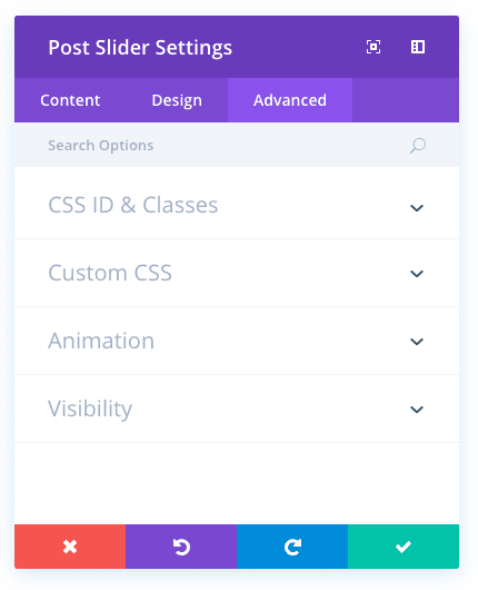
Post Slider Advanced Options
Within the advanced tab, you will find options that more experienced web designers might find useful, such as custom CSS and HTML attributes. Here you can apply custom CSS to any of the module’s many elements. You can also apply custom CSS classes and IDs to the module, which can be used to customize the module within your child theme’s style.css file.
CSS ID
Enter an optional CSS ID to be used for this module. An ID can be used to create custom CSS styling, or to create links to particular sections of your page.
CSS Class
Enter optional CSS classes to be used for this module. A CSS class can be used to create custom CSS styling. You can add multiple classes, separated with a space. These classes can be used in your Divi Child Theme or within the Custom CSS that you add to your page or your website using the Divi Theme Options or Divi Builder Page Settings.
Custom CSS
Custom CSS can also be applied to the module and any of the module’s internal elements. Within the Custom CSS section, you will find a text field where you can add custom CSS directly to each element. CSS input into these settings are already wrapped within style tags, so you need only enter CSS rules separated by semicolons.
Automatic Animation
If you would like the slider to slide automatically, without the visitor having to click the next button, enable this option and then adjust the rotation speed below if desired.
Automatic Animation Speed (in ms)
Here you can designate how fast the slider fades between each slide, if ‘Automatic Animation’ option is enabled above. The higher the number the longer the pause between each rotation.
Continue Automatic Slide on Hover
Turning this on will allow automatic sliding to continue on mouse hover.
Hide Content On Mobile
As the size of the screen gets smaller on mobile devices, screen real estate becomes more precious. Sometimes it’s a good idea to disable some less important slider elements to reduce the size of the slider and make it more readable. Enabling this setting will hide the slider’s text content on mobile.
Hide CTA On Mobile
As the size of the screen gets smaller on mobile devices, screen real estate becomes more precious. Sometimes it’s a good idea to disable some less important slider elements to reduce the size of the slider and make it more readable. Enabling this setting will hide the slider’s call to action buttons on mobile.
Show Image / Video On Mobile
As the size of the screen gets smaller on mobile devices, screen real estate becomes more precious. Sometimes it’s a good idea to disable some less important slider elements to reduce the size of the slider and make it more readable. Enabling this setting will show slide images and videos on mobile (they are disabled by default).
Disable On
This option lets you control which devices your module appears on. You can choose to disable your module on tablets, smart phones or desktop computers individually. This is useful if you want to use different modules on different devices, or if you want to simplify the mobile design by eliminating certain elements from the page.