It’s easier than ever to create pricing tables for your online products. Create as many tables as you want, and control the pricing and features of each. You can even feature a particular plan to increase conversions. Even if your module includes more than one pricing table, it will be treated as one module, and can be placed into any column size.
VIEW A LIVE DEMO OF THIS MODULE
How To Add A Pricing Tables Module To Your Page
Before you can add a pricing tables module to your page, you will first need to jump into the Divi Builder. Once the Divi Theme has been installed on your website, you will notice a Use Divi Builder button above the post editor every time you are building a new page. Clicking this button will enable the Divi Builder, giving you access to all of the Divi Builder’s modules. Next, click the Use Visual Builder button to launch the builder in Visual Mode. You can also click the Use Visual Builder button when browsing your website on the front end if you are logged in to your WordPress Dashboard.

Once you have entered the Visual Builder, you can click the gray plus button to add a new module to your page. New modules can only be added inside of Rows. If you are starting a new page, don’t forget to add a row to your page first. We have some great tutorials about how to use Divi’s row and section elements.
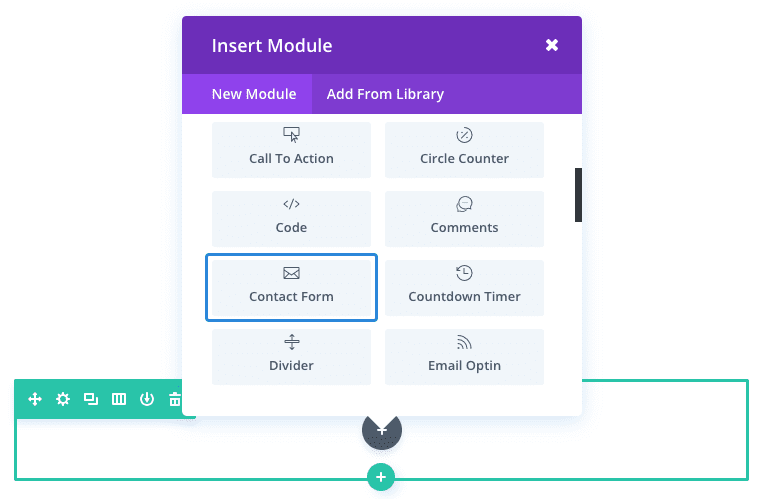
Locate the pricing tables module within the list of modules and click it to add it to your page. The module list is searchable, which means you can also type the word “pricing tables” and then click enter to automatically find and add the pricing tables module! Once the module has been added, you will be greeted with the module’s list of options. These options are separated into three main groups: Content, Design and Advanced.
Use Case Example: Add a Pricing Table to your Product Landing Page
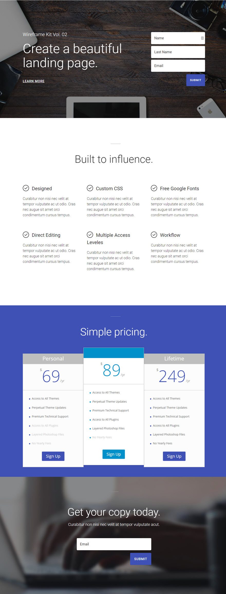
When promoting your products on a landing page, pricing tables can effective showcase your different product pricing options.
In this example, I’m going to add a Pricing Table Module to display three pricing plans (or tables) with one of the those plans standing out as a featured plan in order to increase conversions.
First, add a new regular section to the page where the pricing tables should be displayed. Add a fullwidth (1 column) row to the section and insert a Pricing Tables Module inside the row.
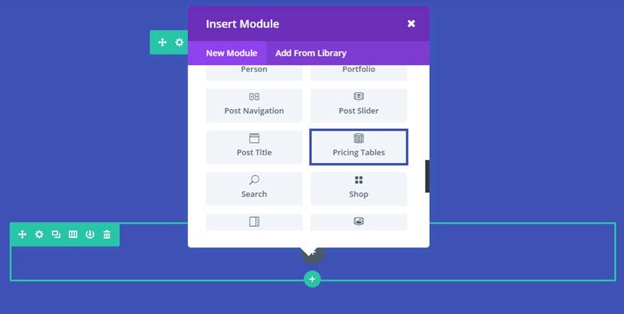
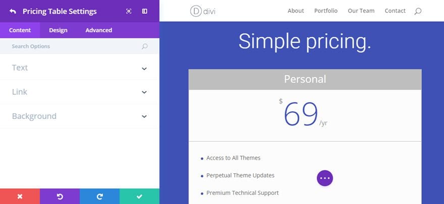
In the Pricing Tables Settings, under the Content tab, click + Add New Item to add your first table.
Update the Pricing Table Settings as follows:
Content Options
Title: Personal
Currency: $
Per: yr
Price: 69
Button Text: Sign Up
Content:
Access to All Themes
Perpetual Theme Updates
Premium Technical Support
-Access to All Plugins
-Layered Photoshop Files
-No Yearly Fees
Button URL: [enter URL for the button]
Background: #ffffff
Design Options
Price Text Color: #3e51b5
Use Custom Styles for Button: YES
Button Text Color: #ffffff
Button Background Color: #3e51b5
Button Border Width: 0px
Save Settings
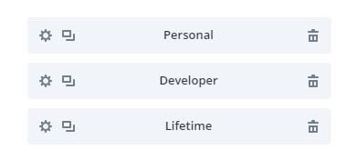
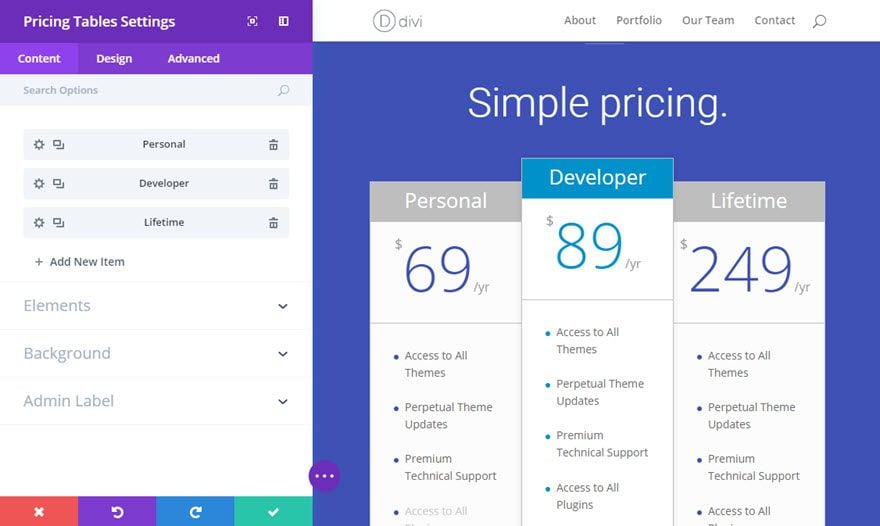
Now duplicate the pricing table you just created two times so that you have a total of three pricing tables.
For the middle pricing table, update the following options:
Content tab
Title: Developer
Price: 89
Content:
Access to All Themes
Perpetual Theme Updates
Premium Technical Support
Access to All Plugins
Layered Photoshop Files
-No Yearly Fees
Button URL: [enter URL for the button]
Design tab
Price Text Color: #0091ca
Button Background Color: #0091ca
For the third pricing table, update the settings as follows:
Content tab
Title: Lifetime
Price: 249
Button Text: Sign Up
Content:
Access to All Themes
Perpetual Theme Updates
Premium Technical Support
Access to All Plugins
Layered Photoshop Files
No Yearly Fees
Button URL: [enter URL for the button]
Save Settings
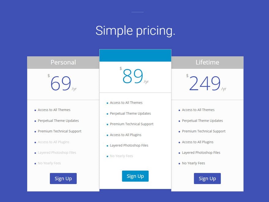
Now go back to the Pricing Tables Settings and update the following:
Content Options
Featured Table Header Background Color: #0091ca
Design Options
Bullet Color: #3e51b5
Featured Table Bullet Color: #0091ca
Save Settings
Now go back and edit the section settings to give the section a background color of #3e51b5.
That’s it. Now you have a pricing table with three options with the middle option set as a featured item that stands out from the rest.
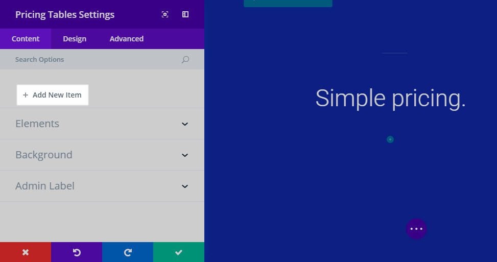
Pricing Tables Content Options
Within the content tab you will find all of the module’s content elements, such as text, images and icons. Anything that controls what appears in your module will always be found within this tab.
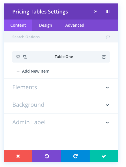
+ Add New Item
This is where you add new pricing tables to your module. Clicking “+ add new item” will open a completely new list of design options specific to that pricing table. See below for individual Price Table Settings.
After you add your first tab, you will see a gray bar appear with the title of your pricing table shown as a label. The gray bar also has three buttons that allow you to edit, duplicate, or delete the table.
Show Bullet
By default, items within pricing tables are displayed as bulleted lists. If you would like to remove the bullets from the list of features, you can disable this option.
Featured Table Background Color
Each pricing table can be “featured.” Featured tables are highlighted in the row, making them stand out against the other options. Using this setting you can change the background color for featured tables only.
Table Header Background Color
Above each pricing table is a header area that includes your table’s title and sub title. You can control the background color of this area independently of the main table background color by selecting your desired color from the color picker.
Featured Table Header Background Color
Each pricing table can be “featured.” Featured tables are highlighted in the row, making them stand out against the other options. Using this setting you can change the header background color for featured tables only.
Background Color
By default, pricing tables have a white background color. If you would like to use a different color for your pricing table background, you can define your custom color here using the color picker.
Admin Label
This will change the label of the module in the builder for easy identification. When using WireFrame view in the Visual Builder, these labels will appear within the module block in the Divi Builder interface.
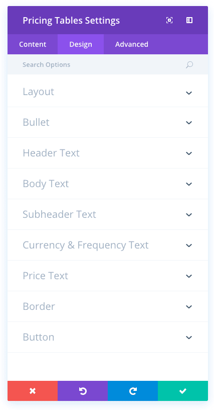
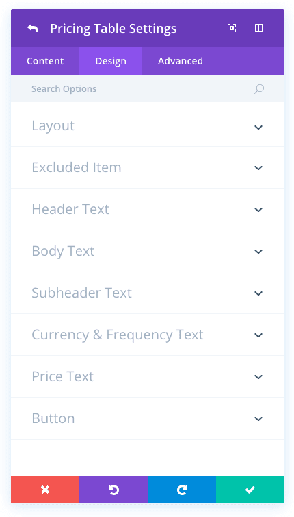
Pricing Tables Design Options
Within the design tab you will find all of the module’s styling options, such as fonts, colors, sizing and spacing. This is the tab you will use to change how your module looks. Every Divi module has a long list of design settings that you can use to change just about anything.
Center List Items
By default, feature lists are aligned left within the pricing table. If you would like to have them aligned center, then you can enable this option.
Remove Featured Table Drop Shadow
By default, pricing tables have a subtle drop shadow behind each table. If you would like to remove this shadow, then you can enable this option.
Center List Items
Here you can choose to center the items listed in your table.
Bullet Color
By default, bullets within the pricing table list will inherit your theme accent color. If you would like to use a different color, you can define it here using the color picker.
Featured Table Bullet Color
If you would like to use a different color for bullets within featured pricing tables, you can define that color here using the color picker.
Featured Table Header Text Color
This option controls the color of your featured table header text color. If you change the featured table header background color, you may also change this option so that to ensure readability.
Header Font
You can change the font of your header text by selecting your desired font from the dropdown menu. Divi comes with dozens of great fonts powered by Google Fonts. By default, Divi uses the Open Sans font for all text on your page. You can also customize the style of your text using the bold, italic, all-caps and underline options.
Header Font Size
Here you can adjust the size of your header text. You can drag the range slider to increase or decrease the size of your text, or you can input your desired text size value directly into the input field to the right of the slider. The input fields supports different units of measurement, which means you can input “px” or “em” following your size value to change its unit type.
Header Text Color
By default, all text colors in Divi will appear as white or dark gray. If you would like to change the color of your header text, choose your desired color from the color picker using this option.
Header Letter Spacing
Letter spacing affects the space between each letter. If you would like to increase the space between each letter in your header text, use the range slider to adjust the space or input your desired spacing size into the input field to the right of the slider. The input fields supports different units of measurement, which means you can input “px” or “em” following your size value to change its unit type.
Header Line Height
Line height affects the space between each line of your header text If you would like to increase the space between each line, use the range slider to adjust the space or input your desired spacing size into the input field to the right of the slider. The input fields supports different units of measurement, which means you can input “px” or “em” following your size value to change its unit type.
Featured Table Body Text Color
This changes the body text color for your featured table. If you change your featured table background color, you may need to change this option to ensure readability.
Body Font
You can change the font of your body text by selecting your desired font from the dropdown menu. Divi comes with dozens of great fonts powered by Google Fonts. By default, Divi uses the Open Sans font for all text on your page. You can also customize the style of your text using the bold, italic, all-caps and underline options.
Body Font Size
Here you can adjust the size of your body text. You can drag the range slider to increase or decrease the size of your text, or you can input your desired text size value directly into the input field to the right of the slider. The input fields supports different units of measurement, which means you can input “px” or “em” following your size value to change its unit type.
Body Text Color
By default, all text colors in Divi will appear as white or dark gray. If you would like to change the color of your body text, choose your desired color from the color picker using this option.
Body Letter Spacing
Letter spacing affects the space between each letter. If you would like to increase the space between each letter in your body text, use the range slider to adjust the space or input your desired spacing size into the input field to the right of the slider. The input fields supports different units of measurement, which means you can input “px” or “em” following your size value to change its unit type.
Body Line Height
Line height affects the space between each line of your body text If you would like to increase the space between each line, use the range slider to adjust the space or input your desired spacing size into the input field to the right of the slider. The input fields supports different units of measurement, which means you can input “px” or “em” following your size value to change its unit type.
Featured Table Subheader Text Color
This changes the subheader text color for your featured table. If you change your featured table background color, you may need to change this option to ensure readability.
Subheader Font
You can change the font of your subheader text by selecting your desired font from the dropdown menu. Divi comes with dozens of great fonts powered by Google Fonts. By default, Divi uses the Open Sans font for all text on your page. You can also customize the style of your text using the bold, italic, all-caps and underline options.
Subheader Font Size
Here you can adjust the size of your subheader text. You can drag the range slider to increase or decrease the size of your text, or you can input your desired text size value directly into the input field to the right of the slider. The input fields supports different units of measurement, which means you can input “px” or “em” following your size value to change its unit type.
Subheader Text Color
By default, all text colors in Divi will appear as white or dark gray. If you would like to change the color of your subheader text, choose your desired color from the color picker using this option.
Subheader Letter Spacing
Letter spacing affects the space between each letter. If you would like to increase the space between each letter in your subheader text, use the range slider to adjust the space or input your desired spacing size into the input field to the right of the slider. The input fields supports different units of measurement, which means you can input “px” or “em” following your size value to change its unit type.
Subheader Line Height
Line height affects the space between each line of your subheader text If you would like to increase the space between each line, use the range slider to adjust the space or input your desired spacing size into the input field to the right of the slider. The input fields supports different units of measurement, which means you can input “px” or “em” following your size value to change its unit type.
Currency & Frequency Font
You can change the font of your currency & frequency text by selecting your desired font from the dropdown menu. Divi comes with dozens of great fonts powered by Google Fonts. By default, Divi uses the Open Sans font for all text on your page. You can also customize the style of your text using the bold, italic, all-caps and underline options.
Currency & Frequency Font Size
Here you can adjust the size of your currency & frequency text. You can drag the range slider to increase or decrease the size of your text, or you can input your desired text size value directly into the input field to the right of the slider. The input fields supports different units of measurement, which means you can input “px” or “em” following your size value to change its unit type.
Currency & Frequency Text Color
By default, all text colors in Divi will appear as white or dark gray. If you would like to change the color of your currency & frequency text, choose your desired color from the color picker using this option.
Currency & Frequency Letter Spacing
Letter spacing affects the space between each letter. If you would like to increase the space between each letter in your currency & frequency text, use the range slider to adjust the space or input your desired spacing size into the input field to the right of the slider. The input fields supports different units of measurement, which means you can input “px” or “em” following your size value to change its unit type.
Currency & Frequency Line Height
Line height affects the space between each line of your currency & frequency text If you would like to increase the space between each line, use the range slider to adjust the space or input your desired spacing size into the input field to the right of the slider. The input fields supports different units of measurement, which means you can input “px” or “em” following your size value to change its unit type.
Featured Table Price Color
This changes the price color for your featured table. If you change your featured table background color, you may need to change this option to ensure readability.
Price Font
You can change the font of your price text by selecting your desired font from the dropdown menu. Divi comes with dozens of great fonts powered by Google Fonts. By default, Divi uses the Open Sans font for all text on your page. You can also customize the style of your text using the bold, italic, all-caps and underline options.
Price Font Size
Here you can adjust the size of your price text. You can drag the range slider to increase or decrease the size of your text, or you can input your desired text size value directly into the input field to the right of the slider. The input fields supports different units of measurement, which means you can input “px” or “em” following your size value to change its unit type.
Price Text Color
By default, all text colors in Divi will appear as white or dark gray. If you would like to change the color of your price text, choose your desired color from the color picker using this option.
Price Letter Spacing
Letter spacing affects the space between each letter. If you would like to increase the space between each letter in your price text, use the range slider to adjust the space or input your desired spacing size into the input field to the right of the slider. The input fields supports different units of measurement, which means you can input “px” or “em” following your size value to change its unit type.
Price Line Height
Line height affects the space between each line of your price text If you would like to increase the space between each line, use the range slider to adjust the space or input your desired spacing size into the input field to the right of the slider. The input fields supports different units of measurement, which means you can input “px” or “em” following your size value to change its unit type.
Use Border
Enabling this option will place a border around your module. This border can be customized using the following conditional settings.
Border Color
This option affects the color of your border. Select a custom color from the color picker to apply it to your border.
Border Width
By default, borders have a width of 1 pixel. You can increase this value by dragging the range slider or by inputting a custom value into the input field to the right of the slider. Custom units of measurements of supported, which means you can change the default unit from “px” to something else, such as em, vh, vw etc.
Border Style
Borders support eight different styles, including: solid, dotted, dashed, double, groove, ridge, inset and outset. Select your desired style from the dropdown menu to apply it to your border.
Use Custom Styles for Button
Enabling this option will reveal various button customization settings that you can use to change the appearance of your module’s button.
Button Text Size
This setting can be used to increase or decrease the size of the text within the button. The button will scale as the text size is increased and decreased.
Button Text Color
By default, buttons assume your theme accent color as defined in the Theme Customizer. This option allows you to assign a custom text color to the button in this module. Select your custom color using the color picker to change the button’s color.
Button Background Color
By default, buttons have a transparent background color. This can be changed by selected your desired background color from the color picker.
Button Border Width
All Divi buttons have a 2px border by default. This border can be increased or decreased in size using this setting. Borders can be removed by inputting a value of 0.
Button Border Color
By default, button borders assume your theme accent color as defined in the Theme Customizer. This option allows you to assign a custom border color to the button in this module. Select your custom color using the color picker to change the button’s border color.
Button Border Radius
Border radius affects how rounded the corners of your buttons are. By default, buttons in Divi has a small border radius that rounds the corners by 3 pixels. You can decrease this to 0 to create a square button or increase it significantly to create buttons with circular edges.
Button Letter Spacing
Letter spacing affects the space between each letter. If you would like to increase the space between each letter in your button text, use the range slider to adjust the space or input your desired spacing size into the input field to the right of the slider. The input fields supports different units of measurement, which means you can input “px” or “em” following your size value to change its unit type.
Button Font
You can change the font of your button text by selecting your desired font from the dropdown menu. Divi comes with dozens of great fonts powered by Google Fonts. By default, Divi uses the Open Sans font for all text on your page. You can also customize the style of your text using the bold, italic, all-caps and underline options.
Add Button Icon
Disabled this setting will remove icons from your button. By default, all Divi buttons display an arrow icon on hover.
Button Icon
If icons are enabled, you can use this setting to pick which icon to use in your button. Divi has various icons to choose from.
Button Icon Color
Adjusting this setting will change the color of the icon that appears in your button. By default, the icon color is the same as your buttons’ text color, but this setting allows you to adjust the color independently.
Button Icon Placement
You can choose to have your button icon display on the left or the right side of your button.
Only Show Icon On Hover for Button
By default, button icons are only displayed on hover. If you would like the icon to always appear, disable this setting.
Button Hover Text Color
When the button is hovered over by a visitor’s mouse, this color will be used. The color will transition from the base color defined in the previous settings.
Button Hover Background Color
When the button is hovered over by a visitor’s mouse, this color will be used. The color will transition from the base color defined in the previous settings.
Button Hover Border Color
When the button is hovered over by a visitor’s mouse, this color will be used. The color will transition from the base color defined in the previous settings.
Button Hover Border Radius
When the button is hovered over by a visitor’s mouse, this value will be used. The value will transition from the base value defined in the previous settings.
Button Hover Letter Spacing
When the button is hovered over by a visitor’s mouse, this value will be used. The value will transition from the base value defined in the previous settings.
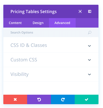
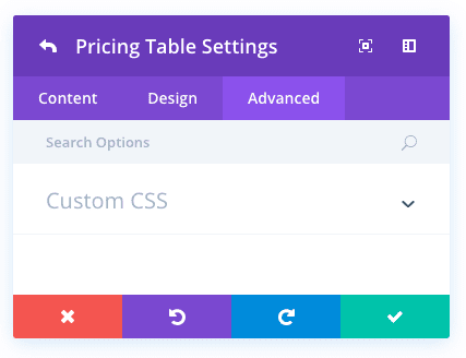
Pricing Tables Advanced Options
Within the advanced tab, you will find options that more experienced web designers might find useful, such as custom CSS and HTML attributes. Here you can apply custom CSS to any of the module’s many elements. You can also apply custom CSS classes and IDs to the module, which can be used to customize the module within your child theme’s style.css file.
CSS ID
Enter an optional CSS ID to be used for this module. An ID can be used to create custom CSS styling, or to create links to particular sections of your page.
CSS Class
Enter optional CSS classes to be used for this module. A CSS class can be used to create custom CSS styling. You can add multiple classes, separated with a space. These classes can be used in your Divi Child Theme or within the Custom CSS that you add to your page or your website using the Divi Theme Options or Divi Builder Page Settings.
Custom CSS
Custom CSS can also be applied to the module and any of the module’s internal elements. Within the Custom CSS section, you will find a text field where you can add custom CSS directly to each element. CSS input into these settings are already wrapped within style tags, so you need only enter CSS rules separated by semicolons.
Visibility
This option lets you control which devices your module appears on. You can choose to disable your module on tablets, smart phones or desktop computers individually. This is useful if you want to use different modules on different devices, or if you want to simplify the mobile design by eliminating certain elements from the page.
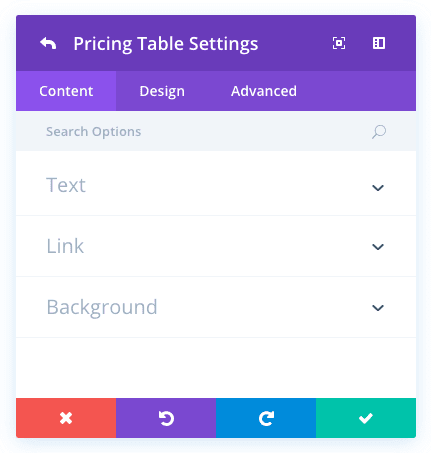
Individual Pricing Tables Content Options
Title
The title you insert here will be used for this pricing option (i.e. Premium).
Subtitle
The Subtitle you insert here will appear below your title (i.e. Most Popular).
Currency
Input your desired currency symbol here.
Per
If your pricing is subscription based, input the subscription cycle here (i.e. Year).
Price
Input the value of the product here.
Button Text
Specify the button text here.
Content
This field is where you can enter the list of features that come or don’t come with your product. Separate each list item on a new line and begin each line with either a + or a – symbol. A + specifies an included feature, whereas a – specifies an excluded feature.
Button URL
At the bottom of each table you can insert a Call To Action button by inserting a valid web URL in this field. Leave this and the
Button Text Field blank if you do not wish to have a button in your pricing table.
Background Color
Define a custom background color for your module, or leave blank to use the default color.
Individual Pricing Tables Design Options
Make This Table Featured
Choose to make this pricing table featured or not with this dropdown menu. Featuring a pricing table will make it stand out amongst
the rest.
Excluded Item Color
For items in your list that have been defined as excluded using the – symbol, you can adjust their color using this setting. For example, you may want to change the color to red or reduce their opacity to signify visually that the items are excluded from the current package.
Header Font
You can change the font of your header text by selecting your desired font from the dropdown menu. Divi comes with dozens of great fonts powered by Google Fonts. By default, Divi uses the Open Sans font for all text on your page. You can also customize the style of your text using the bold, italic, all-caps and underline options.
Header Font Size
Here you can adjust the size of your header text. You can drag the range slider to increase or decrease the size of your text, or you can input your desired text size value directly into the input field to the right of the slider. The input fields supports different units of measurement, which means you can input “px” or “em” following your size value to change its unit type.
Header Text Color
By default, all text colors in Divi will appear as white or dark gray. If you would like to change the color of your header text, choose your desired color from the color picker using this option.
Header Letter Spacing
Letter spacing affects the space between each letter. If you would like to increase the space between each letter in your header text, use the range slider to adjust the space or input your desired spacing size into the input field to the right of the slider. The input fields supports different units of measurement, which means you can input “px” or “em” following your size value to change its unit type.
Header Line Height
Line height affects the space between each line of your header text If you would like to increase the space between each line, use the range slider to adjust the space or input your desired spacing size into the input field to the right of the slider. The input fields supports different units of measurement, which means you can input “px” or “em” following your size value to change its unit type.
Body Font
You can change the font of your body text by selecting your desired font from the dropdown menu. Divi comes with dozens of great fonts powered by Google Fonts. By default, Divi uses the Open Sans font for all text on your page. You can also customize the style of your text using the bold, italic, all-caps and underline options.
Body Font Size
Here you can adjust the size of your body text. You can drag the range slider to increase or decrease the size of your text, or you can input your desired text size value directly into the input field to the right of the slider. The input fields supports different units of measurement, which means you can input “px” or “em” following your size value to change its unit type.
Body Text Color
By default, all text colors in Divi will appear as white or dark gray. If you would like to change the color of your body text, choose your desired color from the color picker using this option.
Body Letter Spacing
Letter spacing affects the space between each letter. If you would like to increase the space between each letter in your body text, use the range slider to adjust the space or input your desired spacing size into the input field to the right of the slider. The input fields supports different units of measurement, which means you can input “px” or “em” following your size value to change its unit type.
Body Line Height
Line height affects the space between each line of your body text If you would like to increase the space between each line, use the range slider to adjust the space or input your desired spacing size into the input field to the right of the slider. The input fields supports different units of measurement, which means you can input “px” or “em” following your size value to change its unit type.
Subheader Font
You can change the font of your subheader text by selecting your desired font from the dropdown menu. Divi comes with dozens of great fonts powered by Google Fonts. By default, Divi uses the Open Sans font for all text on your page. You can also customize the style of your text using the bold, italic, all-caps and underline options.
Subheader Font Size
Here you can adjust the size of your subheader text. You can drag the range slider to increase or decrease the size of your text, or you can input your desired text size value directly into the input field to the right of the slider. The input fields supports different units of measurement, which means you can input “px” or “em” following your size value to change its unit type.
Subheader Text Color
By default, all text colors in Divi will appear as white or dark gray. If you would like to change the color of your subheader text, choose your desired color from the color picker using this option.
Subheader Letter Spacing
Letter spacing affects the space between each letter. If you would like to increase the space between each letter in your subheader text, use the range slider to adjust the space or input your desired spacing size into the input field to the right of the slider. The input fields supports different units of measurement, which means you can input “px” or “em” following your size value to change its unit type.
Subheader Line Height
Line height affects the space between each line of your subheader text If you would like to increase the space between each line, use the range slider to adjust the space or input your desired spacing size into the input field to the right of the slider. The input fields supports different units of measurement, which means you can input “px” or “em” following your size value to change its unit type.
Currency & Frequency Font
You can change the font of your currency & frequency text by selecting your desired font from the dropdown menu. Divi comes with dozens of great fonts powered by Google Fonts. By default, Divi uses the Open Sans font for all text on your page. You can also customize the style of your text using the bold, italic, all-caps and underline options.
Currency & Frequency Font Size
Here you can adjust the size of your currency & frequency text. You can drag the range slider to increase or decrease the size of your text, or you can input your desired text size value directly into the input field to the right of the slider. The input fields supports different units of measurement, which means you can input “px” or “em” following your size value to change its unit type.
Currency & Frequency Text Color
By default, all text colors in Divi will appear as white or dark gray. If you would like to change the color of your currency & frequency text, choose your desired color from the color picker using this option.
Currency & Frequency Letter Spacing
Letter spacing affects the space between each letter. If you would like to increase the space between each letter in your currency & frequency text, use the range slider to adjust the space or input your desired spacing size into the input field to the right of the slider. The input fields supports different units of measurement, which means you can input “px” or “em” following your size value to change its unit type.
Currency & Frequency Line Height
Line height affects the space between each line of your currency & frequency text If you would like to increase the space between each line, use the range slider to adjust the space or input your desired spacing size into the input field to the right of the slider. The input fields supports different units of measurement, which means you can input “px” or “em” following your size value to change its unit type.
Price Font
You can change the font of your price text by selecting your desired font from the dropdown menu. Divi comes with dozens of great fonts powered by Google Fonts. By default, Divi uses the Open Sans font for all text on your page. You can also customize the style of your text using the bold, italic, all-caps and underline options.
Price Font Size
Here you can adjust the size of your price text. You can drag the range slider to increase or decrease the size of your text, or you can input your desired text size value directly into the input field to the right of the slider. The input fields supports different units of measurement, which means you can input “px” or “em” following your size value to change its unit type.
Price Text Color
By default, all text colors in Divi will appear as white or dark gray. If you would like to change the color of your price text, choose your desired color from the color picker using this option.
Price Letter Spacing
Letter spacing affects the space between each letter. If you would like to increase the space between each letter in your price text, use the range slider to adjust the space or input your desired spacing size into the input field to the right of the slider. The input fields supports different units of measurement, which means you can input “px” or “em” following your size value to change its unit type.
Price Line Height
Line height affects the space between each line of your price text If you would like to increase the space between each line, use the range slider to adjust the space or input your desired spacing size into the input field to the right of the slider. The input fields supports different units of measurement, which means you can input “px” or “em” following your size value to change its unit type.
Use Custom Styles for Button
Enabling this option will reveal various button customization settings that you can use to change the appearance of your module’s button.
Button Text Size
This setting can be used to increase or decrease the size of the text within the button. The button will scale as the text size is increased and decreased.
Button Text Color
By default, buttons assume your theme accent color as defined in the Theme Customizer. This option allows you to assign a custom text color to the button in this module. Select your custom color using the color picker to change the button’s color.
Button Background Color
By default, buttons have a transparent background color. This can be changed by selected your desired background color from the color picker.
Button Border Width
All Divi buttons have a 2px border by default. This border can be increased or decreased in size using this setting. Borders can be removed by inputting a value of 0.
Button Border Color
By default, button borders assume your theme accent color as defined in the Theme Customizer. This option allows you to assign a custom border color to the button in this module. Select your custom color using the color picker to change the button’s border color.
Button Border Radius
Border radius affects how rounded the corners of your buttons are. By default, buttons in Divi has a small border radius that rounds the corners by 3 pixels. You can decrease this to 0 to create a square button or increase it significantly to create buttons with circular edges.
Button Letter Spacing
Letter spacing affects the space between each letter. If you would like to increase the space between each letter in your button text, use the range slider to adjust the space or input your desired spacing size into the input field to the right of the slider. The input fields supports different units of measurement, which means you can input “px” or “em” following your size value to change its unit type.
Button Font
You can change the font of your button text by selecting your desired font from the dropdown menu. Divi comes with dozens of great fonts powered by Google Fonts. By default, Divi uses the Open Sans font for all text on your page. You can also customize the style of your text using the bold, italic, all-caps and underline options.
Add Button Icon
Disabled this setting will remove icons from your button. By default, all Divi buttons display an arrow icon on hover.
Button Icon
If icons are enabled, you can use this setting to pick which icon to use in your button. Divi has various icons to choose from.
Button Icon Color
Adjusting this setting will change the color of the icon that appears in your button. By default, the icon color is the same as your buttons’ text color, but this setting allows you to adjust the color independently.
Button Icon Placement
You can choose to have your button icon display on the left or the right side of your button.
Only Show Icon On Hover for Button
By default, button icons are only displayed on hover. If you would like the icon to always appear, disable this setting.
Button Hover Text Color
When the button is hovered over by a visitor’s mouse, this color will be used. The color will transition from the base color defined in the previous settings.
Button Hover Background Color
When the button is hovered over by a visitor’s mouse, this color will be used. The color will transition from the base color defined in the previous settings.
Button Hover Border Color
When the button is hovered over by a visitor’s mouse, this color will be used. The color will transition from the base color defined in the previous settings.
Button Hover Border Radius
When the button is hovered over by a visitor’s mouse, this value will be used. The value will transition from the base value defined in the previous settings.
Button Hover Letter Spacing
When the button is hovered over by a visitor’s mouse, this value will be used. The value will transition from the base value defined in the previous settings.
Individual Pricing Tables Advanced Options
Custom CSS
Custom CSS can also be applied to the module and any of the module’s internal elements. Within the Custom CSS section, you will find a text field where you can add custom CSS directly to each element. CSS input into these settings are already wrapped within style tags, so you need only enter CSS rules separated by semicolons.