Using the search module, you can place a search form anywhere on your site. This search form will allow your visitors to search through all of your website’s content, including all pages and blog posts. This gives you the functionality of the WordPress search widget along with the flexibility of the Divi Builder. Not only can you control the search forms location on the page, you can also customize its design.
VIEW A LIVE DEMO OF THIS MODULE
How To Add A Search Module To Your Page
Before you can add a search module to your page, you will first need to jump into the Divi Builder. Once the Divi Theme has been installed on your website, you will notice a Use Divi Builder button above the post editor every time you are building a new page. Clicking this button will enable the Divi Builder, giving you access to all of the Divi Builder’s modules. Next, click the Use Visual Builder button to launch the builder in Visual Mode. You can also click the Use Visual Builder button when browsing your website on the front end if you are logged in to your WordPress Dashboard.

Once you have entered the Visual Builder, you can click the gray plus button to add a new module to your page. New modules can only be added inside of Rows. If you are starting a new page, don’t forget to add a row to your page first. We have some great tutorials about how to use Divi’s row and section elements.
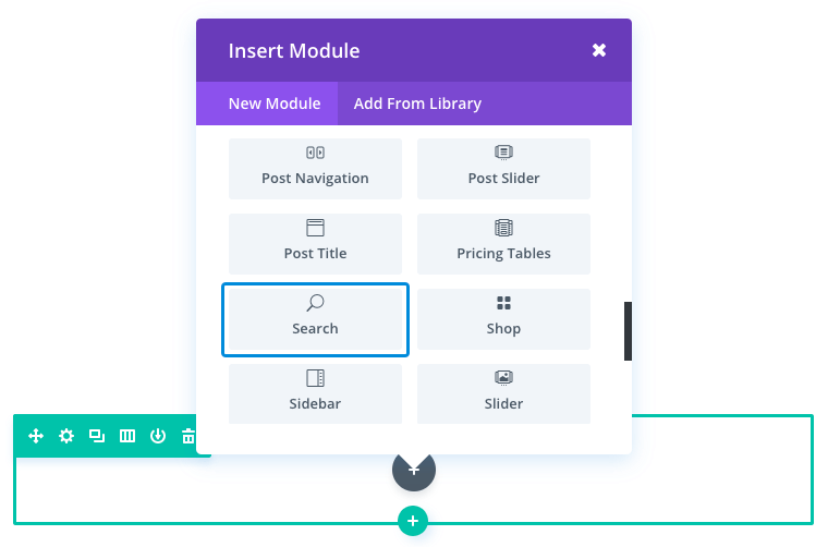
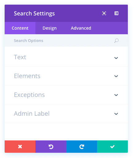
Locate the search module within the list of modules and click it to add it to your page. The module list is searchable, which means you can also type the word “search” and then click enter to automatically find and add the search module! Once the module has been added, you will be greeted with the module’s list of options. These options are separated into three main groups: Content, Design and Advanced.
Use Case Example: Adding a Custom Search Module to a Fullwidth Blog Page
For this example, I’m going to show you how to add a Search Module to be a main call to action at the top of a blog page. This allows users to easily search the content of your blog without any clutter.
This page has a fullwidth header at the top with the search module directly below it. Under the search module is a Blog Module using the grid layout.
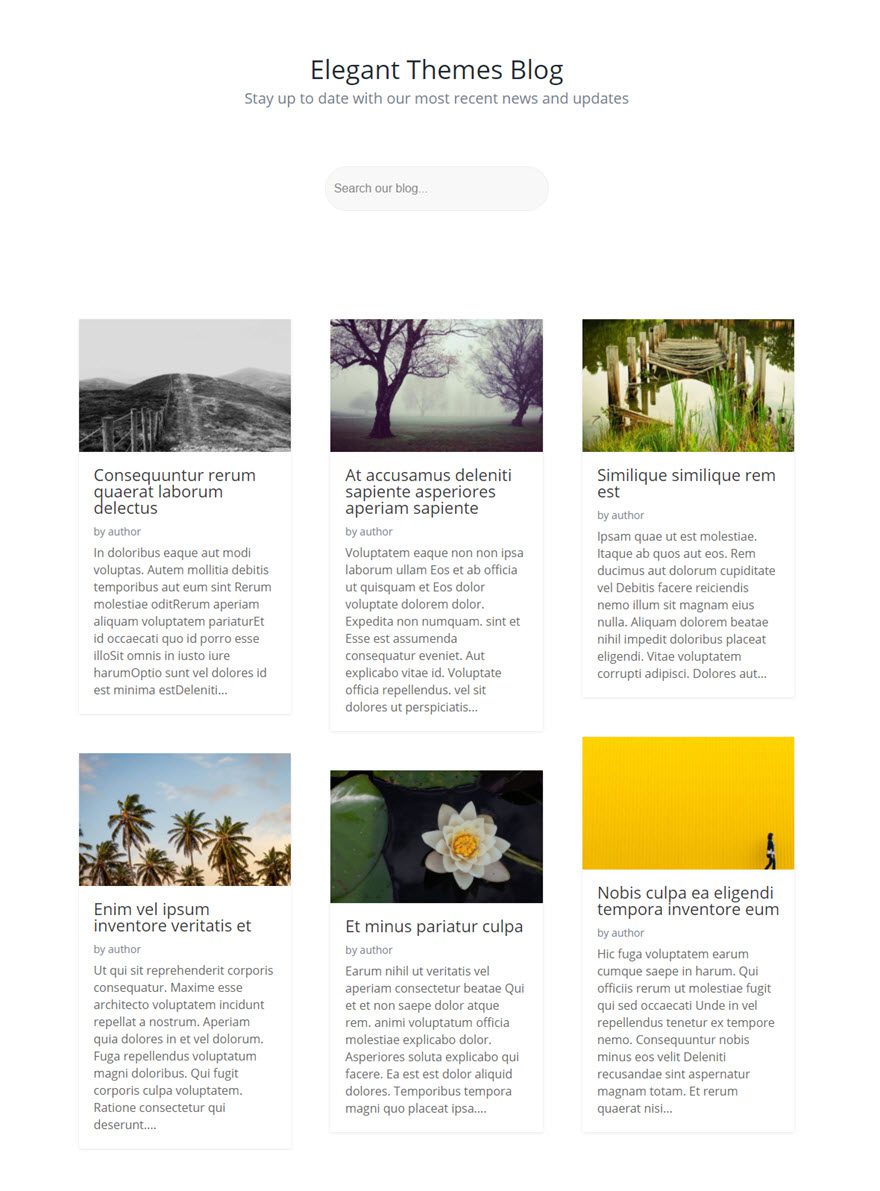
Using the Visual Builder, add a new standard section to the blog page with a fullwidth (1 column) row. Then insert the Search Module into the row.
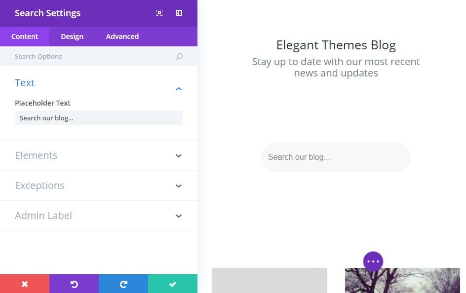
Update the Search Module Settings as follows:
Content Options
Placeholder Text: Search our blog…
Hide Button: YES
Design Options
Input Field Background Color: #f8f8f8
Placeholder Color: #888888
Input Font Size: 16px
Input Text Color: #888888
Input Line Height: 1em
Custom Padding: 20px Top, 20px Bottom
Save Settings
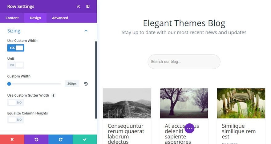
Now go back to edit the width of the row containing your search module. Under the Design tab of the Row Settings, give the row a custom width of 300px. This will keep the search module compact and centered on the page.
That’s it!
Search Content Options
Within the content tab you will find all of the module’s content elements, such as text, images and icons. Anything that controls what appears in your module will always be found within this tab.
Placeholder Text
Type the text you want to use as placeholder for the search field.
Hide Button
Turning this on will hide the Search button.
Exclude Pages
Turning this on will exclude Pages from search results.
Exclude Posts
Turning this on will exclude Posts from search results.
Exclude Categories
Choose which categories you would like to exclude from the search results.
Admin Label
This will change the label of the module in the builder for easy identification. When using WireFrame view in the Visual Builder, these labels will appear within the module block in the Divi Builder interface.
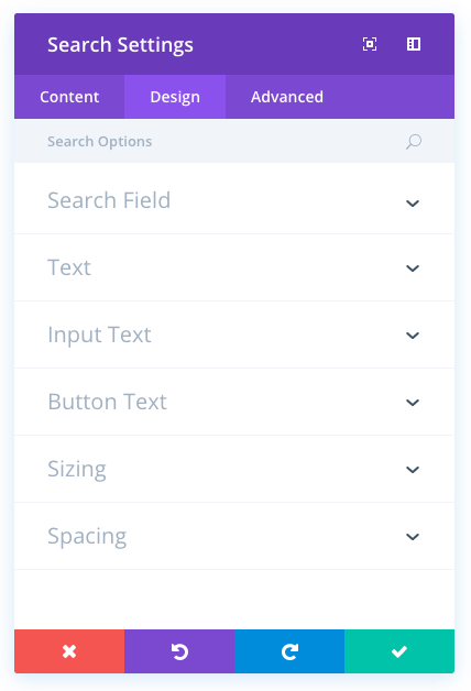
Search Design Options
Within the design tab you will find all of the module’s styling options, such as fonts, colors, sizing and spacing. This is the tab you will use to change how your module looks. Every Divi module has a long list of design settings that you can use to change just about anything.
Input Field Background Color
Here you can change the background color of the search bar.
Placeholder Color
Before the search field is used, placeholder text exists inside of the field. If you have adjusted the field background color, you may also want to adjust the placeholder text color to ensure that it is readable.
Text Color
Here you can choose the value of your text. If you are working with a dark background, then your text should be set to light. If you are working with a light background, then your text should be dark.
Text Orientation
This controls the how your text is aligned within the module.
Input Font
You can change the font of your input text by selecting your desired font from the dropdown menu. Divi comes with dozens of great fonts powered by Google Fonts. By default, Divi uses the Open Sans font for all text on your page. You can also customize the style of your text using the bold, italic, all-caps and underline options.
Input Font Size
Here you can adjust the size of your input text. You can drag the range slider to increase or decrease the size of your text, or you can input your desired text size value directly into the input field to the right of the slider. The input fields supports different units of measurement, which means you can input “px” or “em” following your size value to change its unit type.
Input Text Color
By default, all text colors in Divi will appear as white or dark gray. If you would like to change the color of your input text, choose your desired color from the color picker using this option.
Input Letter Spacing
Letter spacing affects the space between each letter. If you would like to increase the space between each letter in your input text, use the range slider to adjust the space or input your desired spacing size into the input field to the right of the slider. The input fields supports different units of measurement, which means you can input “px” or “em” following your size value to change its unit type.
Input Line Height
Line height affects the space between each line of your input text If you would like to increase the space between each line, use the range slider to adjust the space or input your desired spacing size into the input field to the right of the slider. The input fields supports different units of measurement, which means you can input “px” or “em” following your size value to change its unit type.
Button and Border Color
This will change the search button’s background and border color.
Button Font
You can change the font of your button text by selecting your desired font from the dropdown menu. Divi comes with dozens of great fonts powered by Google Fonts. By default, Divi uses the Open Sans font for all text on your page. You can also customize the style of your text using the bold, italic, all-caps and underline options.
Button Font Size
Here you can adjust the size of your button text. You can drag the range slider to increase or decrease the size of your text, or you can input your desired text size value directly into the input field to the right of the slider. The input fields supports different units of measurement, which means you can input “px” or “em” following your size value to change its unit type.
Button Text Color
By default, all text colors in Divi will appear as white or dark gray. If you would like to change the color of your button text, choose your desired color from the color picker using this option.
Button Letter Spacing
Letter spacing affects the space between each letter. If you would like to increase the space between each letter in your button text, use the range slider to adjust the space or input your desired spacing size into the input field to the right of the slider. The input fields supports different units of measurement, which means you can input “px” or “em” following your size value to change its unit type.
Button Line Height
Line height affects the space between each line of your button text If you would like to increase the space between each line, use the range slider to adjust the space or input your desired spacing size into the input field to the right of the slider. The input fields supports different units of measurement, which means you can input “px” or “em” following your size value to change its unit type.
Max Width
By default, search bar max width is set to 100%. This means that the search bar will be displayed at its natural width unless the width of the search bar exceeds the width of the parent column, in which case the search bar will be limited to 100% of the width of the column. If you would like to further restrict the max width of the search bar, you can do so by entering your desired max width value here. For example, a value of 50% would limit the width of the search bar to 50% of the width of the parent column.
Custom Margin
Margin is the space added outside of your module, between the module and the next element above, below or to the left and right of it. You can add custom margin values to any of the module’s four sides. To remove custom margin, delete the added value from the input field. By default these values are measured in pixels, but you can input custom units of measurement into the input fields.
Custom Padding
Padding is the space added inside of your module, between the edge of the module and its internal elements. You can add custom padding values to any of the module’s four sides. To remove custom margin, delete the added value from the input field. By default these values are measured in pixels, but you can input custom units of measurement into the input fields.
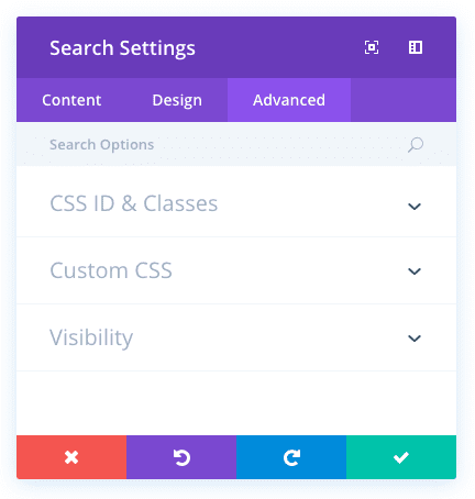
Search Advanced Options
Within the advanced tab, you will find options that more experienced web designers might find useful, such as custom CSS and HTML attributes. Here you can apply custom CSS to any of the module’s many elements. You can also apply custom CSS classes and IDs to the module, which can be used to customize the module within your child theme’s style.css file.
CSS ID
Enter an optional CSS ID to be used for this module. An ID can be used to create custom CSS styling, or to create links to particular sections of your page.
CSS Class
Enter optional CSS classes to be used for this module. A CSS class can be used to create custom CSS styling. You can add multiple classes, separated with a space. These classes can be used in your Divi Child Theme or within the Custom CSS that you add to your page or your website using the Divi Theme Options or Divi Builder Page Settings.
Custom CSS
Custom CSS can also be applied to the module and any of the module’s internal elements. Within the Custom CSS section, you will find a text field where you can add custom CSS directly to each element. CSS input into these settings are already wrapped within style tags, so you need only enter CSS rules separated by semicolons.
Visibility
This option lets you control which devices your module appears on. You can choose to disable your module on tablets, smart phones or desktop computers individually. This is useful if you want to use different modules on different devices, or if you want to simplify the mobile design by eliminating certain elements from the page.