Tabs are a great way to consolidate information and improve user experience on your page. Using Divi, you can create any number of tabs that will look great inside any sized column. At ¼ columns, tab buttons are stacked and remain visible. At larger sizes, tab buttons lay in a horizontal row. Any kind of content can be placed within a tab as tab content is controlled using the standard WordPress post editor.
VIEW A LIVE DEMO OF THIS MODULE
How To Add A Tabs Module To Your Page
Before you can add a tabs module to your page, you will first need to jump into the Divi Builder. Once the Divi Theme has been installed on your website, you will notice a Use Divi Builder button above the post editor every time you are building a new page. Clicking this button will enable the Divi Builder, giving you access to all of the Divi Builder’s modules. Next, click the Use Visual Builder button to launch the builder in Visual Mode. You can also click the Use Visual Builder button when browsing your website on the front end if you are logged in to your WordPress Dashboard.

Once you have entered the Visual Builder, you can click the gray plus button to add a new module to your page. New modules can only be added inside of Rows. If you are starting a new page, don’t forget to add a row to your page first. We have some great tutorials about how to use Divi’s row and section elements.
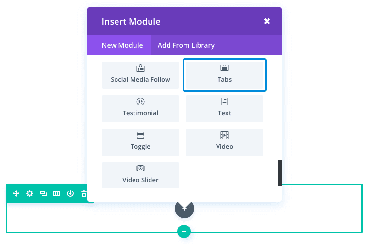
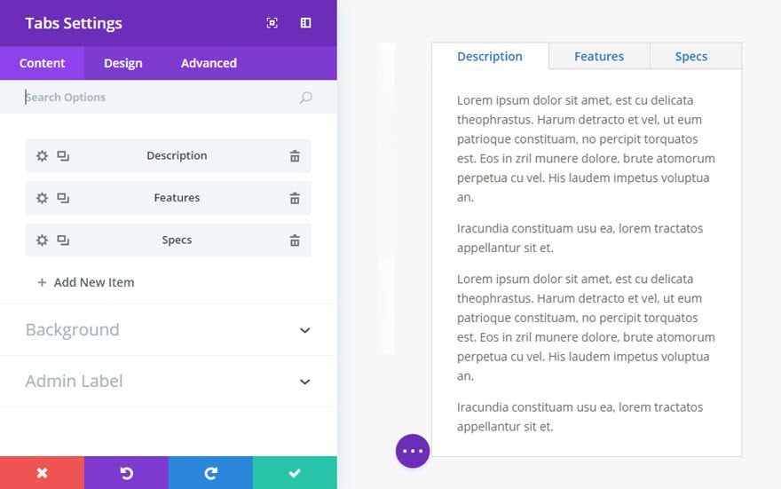
Locate the tabs module within the list of modules and click it to add it to your page. The module list is searchable, which means you can also type the word “tabs” and then click enter to automatically find and add the tabs module! Once the module has been added, you will be greeted with the module’s list of options. These options are separated into three main groups: Content, Design and Advanced.
Use Case Example: Adding Tabs to Organize Product Features
Tabs are great for consolidating and organizing your content. One common use for tabs is to showcase features of a product. If your product has three or more features, organizing them into tabs will create a better user experience, allowing the user to easily digest the content.
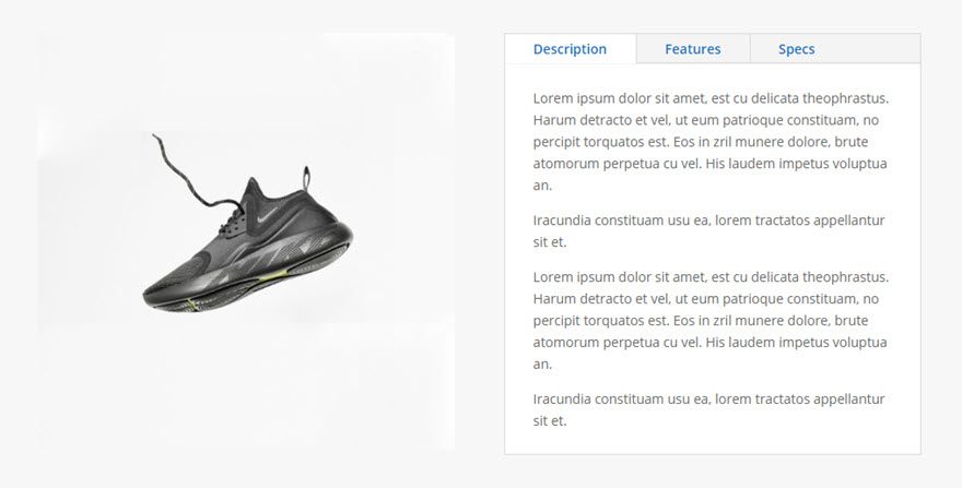
For this example, I’m going to show you how to add a Tab Module to a product page for the purpose of showcasing the product features.
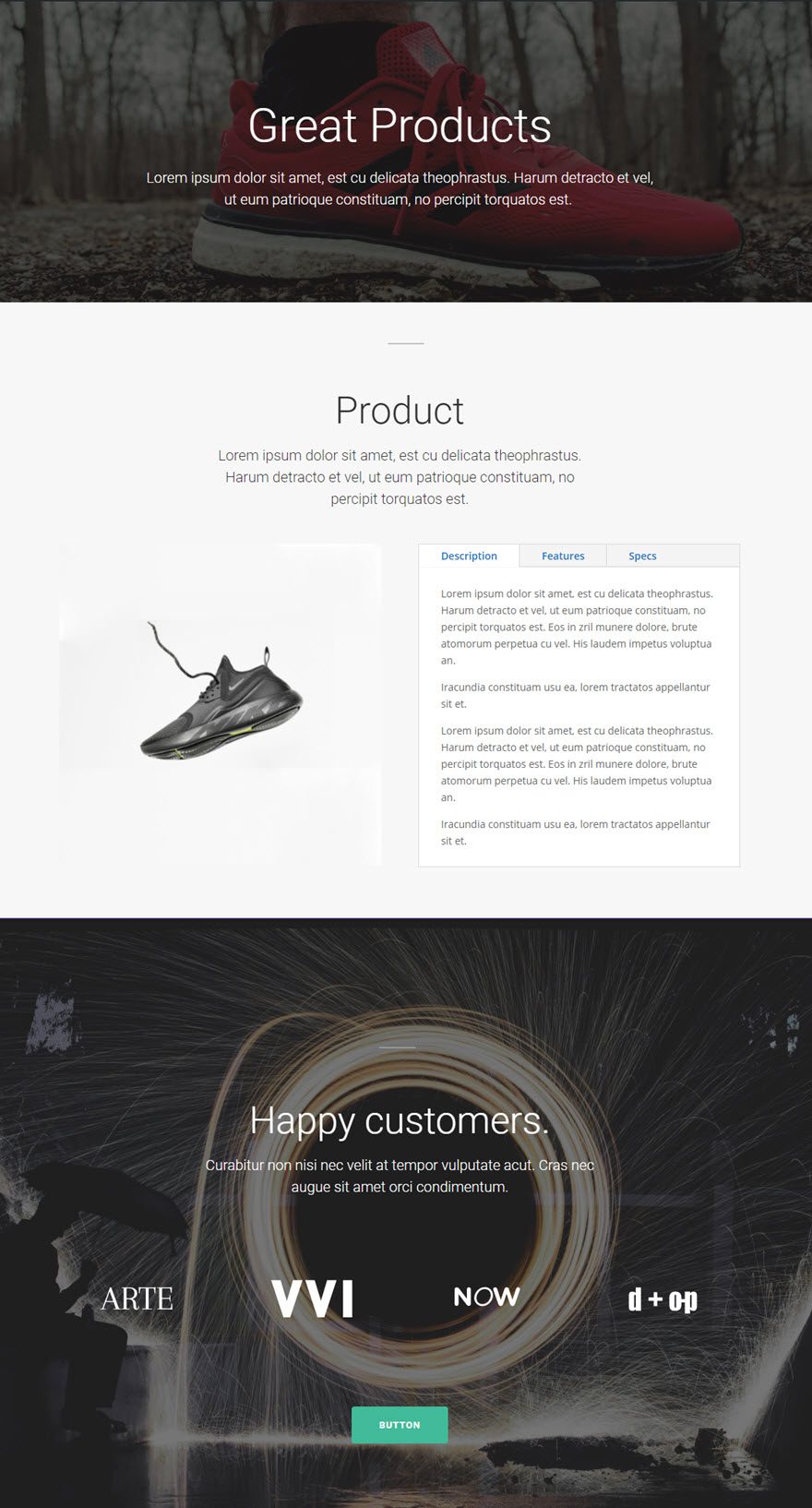
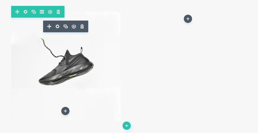
First add a new section and a new row with a 1/2 1/2 column layout. On the left column, add your 510 x 510 product image using the Image Module.
On the right column, add the Tabs Module. Under the Content Tab of the Tabs Module Settings, click “add a new item” to bring up the settings for your first specific tab. Update the tab settings under the Content tab as follows:
Title: [add the title or label of your tab]
Content: [add the main body content of your tab]
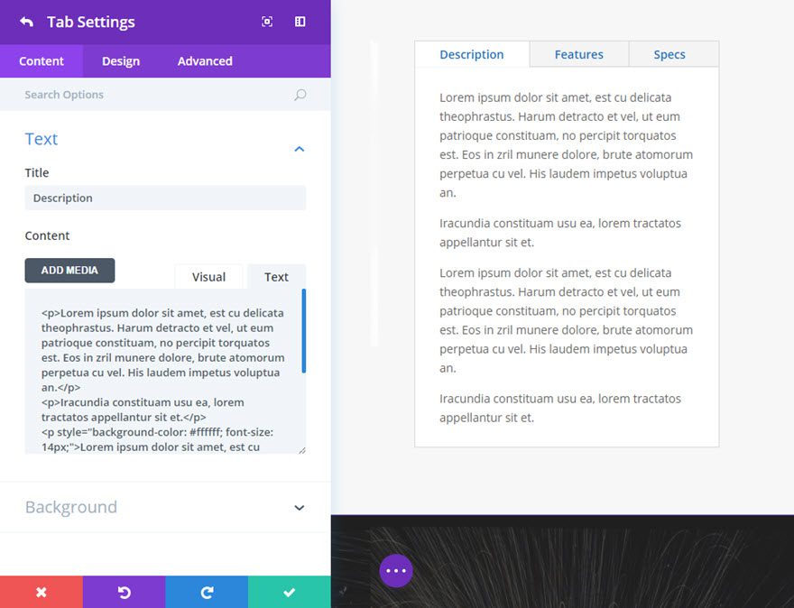
Save the tab settings and repeat this process to create two more tabs.
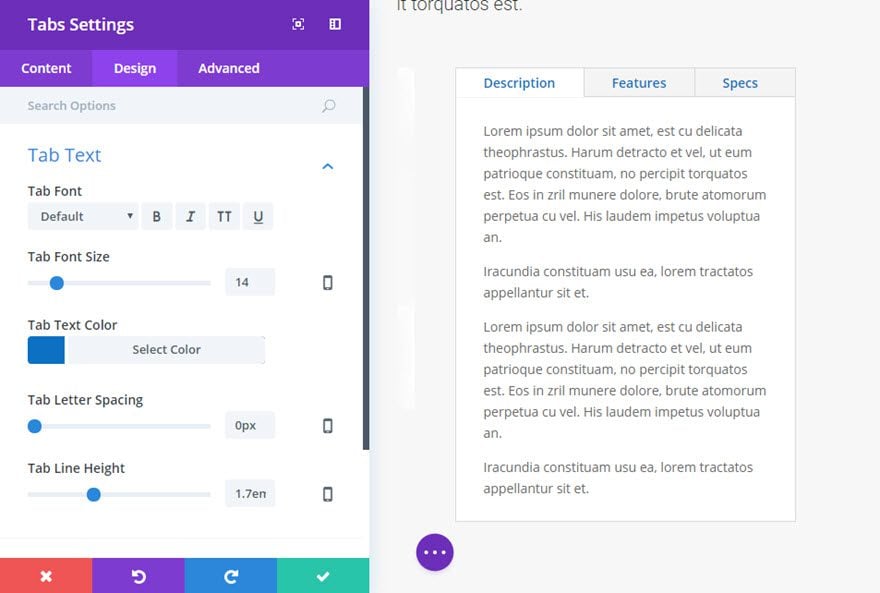
Once your tabs have been created, go to the Design tab of your Tabs Settings and change the Tab Text Color to #0c71c3 (blue).
Now you have a effective Tabs Module you can use to display information on your products.
Tabs Content Options
Within the content tab you will find all of the module’s content elements, such as text, images and icons. Anything that controls what appears in your module will always be found within this tab.
Add New Item
This is where you add new tabs to your Tabs Module. Clicking “add new item” will open a completely new list of design settings (including Content, Design, Advanced) for your new tab. See below for individual tab settings.
After you add your first tab, you will see a gray bar appear with the title of your tab shown as a label. The gray bar also has three buttons that allow you to edit the settings of the tab, duplicate the tab, or delete the tab.
If you have customized the settings for your first tab and want to keep the style throughout the rest of your tabs, click the duplicate icon/button. You will see a new gray bar appear beneath the first tab. Click to edit the content of the new tab and repeat this process for the rest of your tabs.
Active Tab Background Color
This option allows you to add a background color to your active tabs. A tab is considered active when it has been clicked or selected. By default your active tab background color is white and matches the default white background color of your tab content.
Inactive Tab Background Color
This option allows you to add a background color to your inactive tabs. A tab is considered inactive when it has not been clicked or selected. By default your inactive tab background color is gray in contrast to the default white background color of the active tab. This background color contrast for active and inactive tabs allow for easier navigation between tabs.
Background Color
This option allows you to change the background color of the tab module content.
Background Image
This option allows you to add a background image of the tab module content.
Admin Label
By default, your video module will appear with a label that reads ‘Video’ in the builder. The Admin Label allows you to change this label for easy identification.
Tabs Design Options
Within the design tab you will find all of the module’s styling options, such as fonts, colors, sizing and spacing. This is the tab you will use to change how your module looks. Every Divi module has a long list of design settings that you can use to change just about anything.
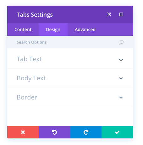
Tab Text Design Options
These options control the style of your tab text (or title) for all tabs in your module. Options include tab font, tab font size, tab text color, tab letter spacing, and tab line height.
Body Text Design Options
These options control the style of your tab modules body text (the text entered in the content of your individual tabs). Options include body font, body font size, body text color, body letter spacing, and body line height.
Use Border
Select “YES” for this option if you would like to add a border to your tabs module. Once “YES” is selected, you will see additional styling options for your border including border color, border width, and border style.
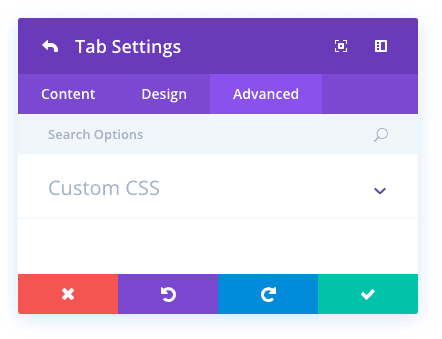
Tabs Advanced Options
Within the advanced tab, you will find options that more experienced web designers might find useful, such as custom CSS and HTML attributes. Here you can apply custom CSS to any of the module’s many elements. You can also apply custom CSS classes and IDs to the module, which can be used to customize the module within your child theme’s style.css file.
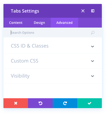
CSS ID and Classes
This can be used to add a unique CSS ID or Class to your tabs module. These can then be used in your stylesheet or within the Theme Options Custom CSS box to apply custom styling to the module. CSS ID’s can also be targeted with anchor links to link to certain areas of your page.
Custom CSS
Here you can add custom CSS to your tabs module.
Visibility
Here you can choose to hide (or disable) your tabs module on certain devices. You can choose to disable the module on phone, tablet, and/or desktop.
Individual Tabs Content Options
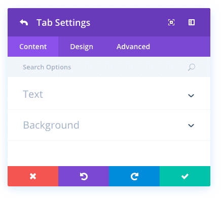
Title
This option serves as the title of your tab. This will be the text in the actual tab that users click to toggle through the live tag module.
Content
This is where you enter the body text of your tab using the built-in wysiwyg editor.
Background Color
Here you can add a background color for your tab.
Background Image
Here you can add a background image for your tab.
Individual Tabs Design Options
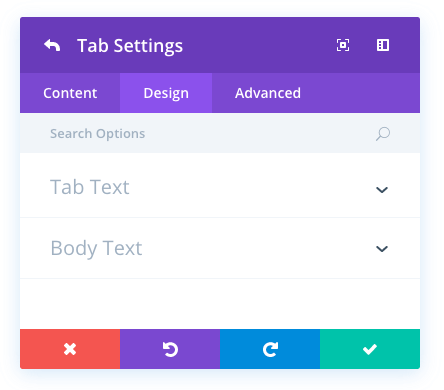
Tab Text
This option allows you to design the tab text which is the title of your tab. Options include font, font size, text color, letter spacing, and line height.
Body Text
This option allows you to design the body text of your tab. Options include font, font size, text color, letter spacing, and line height.
Individual Tabs Advanced Options
Custom CSS
Here you can add custom CSS to the specific tab your are editing. This CSS will be applied to this tab only.